TYPOGRAPHY - Exercises

05/04/19 – 26/04/19 (Week 1 – Week 4)
Arletta Leviani (0337751)
Typography
Exercise
LECTURE NOTES
Lecture 1: Briefing05/04/19 (week 1)
Today we meet both of our lectures, Mr Vinod and Mr Shamsul, we are briefed about what are we going to do in the next few weeks. It turns out that this year modules (MIB) changes and some of the exercises is not included. He said that those exercises is not really on the booklet but a foundation for typography so student can do the exercises better.
After everything being covered, Mr Shamsul help us make our own website for e-portfolio. Mr Vinods told us that our eportfolio is crucial because our final score is not only on our final work, but also our progress and eportfolio. We should put everything there including our sketches, even our scrapped attempt. We were also told that we have to read books from the library, and put it in the eportfolio as well. He gave us step by step instructions, he told us what we should add in the blog and how to do it, even gave us examples from our senior.
After everything done, he gave us our first exercise about lettering, we were told to draw our name with a certain personality that we picked. Each need to do 10 lettering from 1 personality that we picked.
Important note:
- Lettering: is to draw letters
- Typography: is to write letters
12/04/19 (week 2)
Today we started at 08.30 instead of 8 AM, we were given a bit of instructions for our blog and how we filled the feedback sheets, he said that we should update everything. After we updated our blog, we start our lecture. Typography is a form of art that can effects people reaction.
Important note:
- Font, weight of fonts (bolt, regular, italic) ae. Times new roman bolt/Times new roman italic/Times new roman regular.
 |
| Fig 1.1 one of Mr Vinod powerpoint slides |
- Typeface, typeface refers to the entire family of fonts that share the same characteristic. ae. Times new roman, Verdana, Arial.
 |
| Fig 1.2 one of Mr Vinod powerpoint slides. |
- Typefamily, a type family refers to the many weights within an individual typeface.
 |
| Fig 1.3 one of Mr Vinod powerpoint slides. |
After a 15 minutes break, we are told that we have to change our e-portfolio from wordpress to blogger, therefore Mr Shamsul help us to transfer everything that we've done to our new website and explain everything in detailed so we manage to do it by our self. After everything settled, we put out our exercises for Mr Vinod and Mr Shamsul advise. They go around and gave us feedback. He then told us to transfer our lettering to Adobe Illustrator.
Lecture 3: Typography / BasicFile
19/04/19 (week 3)
Important notes:
- Baseline: The imaginary line the visual base of the letterforms
- Median: The imaginary line defining the x-height of the letterforms
- X-height: The height in any typeface of the lowercase 'x'
Typeface anatomy:
- Strokes: any line that defines the basic letterform
- Apex/ Vertex: The point created by joining two diagonal stems (apex above and vertex below)
- Arm: short strokes off the stem of the letterform, either horizontal (E, F, L) or inclined upward (K, Y)
- Ascender: the portion of the stem of a lowercase letterform that projects above the median.
- Barb: The half-serif finish on some curved stroke.
- Beak: The half-serif finish on some horizontal arms.
- Bowl: The rounded form that describes a counter. The bowl may be either open or closed.
- Bracket: The transition between the serif and the stem.
- Cross Bar: The horizontal stroke in a letterform that joins two stems together.
- Cross Stroke: The horizontal stroke in a letterform that joins two stems together.
- Crotch: The interior space where two strokes meet.
- Descender: The portion of the stem of a lowercase letterform that projects below the baseline.
- Ear: The stroke extending out from the main stem or body of the letterform.
- Em/en: Originally refering to the width of an uppercase M, and em is now the distance equal to the size of the typeface (an em in 48 points, for example). An en is half the size of an em. Most often used to describe em/en spaces and em/en dashes.
- Finial: The rounded non-serif terminal to a stroke.
- Leg: Short stroke off the stem of the letterform, either at the bottom of the stroke (L) or inclined downward (K, R).
- Ligature: The character formed by the combination of two or more letterforms.
- Link: The stroke that connects the bowl and the loop of a lowercase G.
- Loop: In some typefaces, the bowl created in the descender of the lowercase G.
- Serif: The right-angled or oblique foot at the end of the stroke.
- Shoulder: The curved stroke that is not part of a bowl.
- Spine: The curved stem of the S.
- Spur: The extension the articulates the junction of the curved and rectilinear stroke.
- Stem: The significant vertical or oblique stroke.
- Stress: The orientation of the letterform, indicated by the thin stroke in round forms.
- Swash: The flourish that extends the stroke of the letterform.
- Tail: The curved diagonal stroke at the finish of certain letterforms.
- Terminal: The self-contained finish of a stroke without a serif. This is something of a catch-all term. Terminals may be flat (‘T’ above), flared, acute, (‘t’ above), grave, concave, convex, or rounded as a ball or a teardrop (see finial).
 |
| Fig 2.1 typeface anatomy https://www.behance.net/gallery/33731058/Typographic-Anatomy-Study |
Letterform:
 |
| Fig 2.2 Uppercase |
Lowercase is lowercase letter include the same characters as uppercase.
 |
| Fig 2.3 Lowercase |
Small Capitals is uppercase letterforms draw to the x-height of the typeface. Small caps are primarily found in serif fonts as part of what is often called expert set.
 |
| Fig 2.4 Small Capitals |
Uppercase Numerals, also called lining figures, they are the same height as uppercase letters and are all set to the same kerning width. it is most successfully used with tabular material.
Lowercase Numerals, also known as old style figures, they are set to x-height with ascenders and descenders. It is less common in sans serif type-faces than in serif.
Italic, it is refered back to fifteenth century Italian cursive handwritting.
Ornaments, used as flourishes in invitation or certificates. They usually are provided as a font in a larger typeface family.
Typefaces:
- Roman
- Italic
- Oblique
- Boldface
- Light
- Condense
- Extended
 |
| Fig 2.5 Typefaces |
Lecture 4: Development and Timeline
26/04/19 (week 4)
Writing meant by scratching into wet clay with sharpened stick or carving into stone with a chisel. Uppercase forms are a combination of straight lines and pieces of circles. Uppercase letter have been evolving through the years because of the different tool and materials that have been used.
 |
| Fig 3.1 the development of uppercase form |
The Greek change the direction of writing, they developed a new style of writing name boustrophedon, which meant that the lines of text read from right to left, then left to right and so on. As they changed the orientation of the direction of reading, they also change their orientation of letterform.
 |
| Fig 3.2 Boustrophedon |
Hand Script from from 3rd – 10th century C.E.
Square capital were the written version that can be found in Roman monuments. These letterforms have serifs added to the finish of the main strokes. A compressed version of square capitals, rustic capitals allowed for more words written on a sheets of parchment, also it took less time to write. Even when they took less time to write, they are harder to read due to their compressed nature. Both square and rustic usually reserved for document.
Lowercase letter is form because uppercase letter written in cursive to simplified the speed, especially in the shape of the A, D, E, H, H, M, U and Q. A futher formalization of the cursive hand, half-uncials mark the formal beginning of lowercase letterform, replete with ascenders and descender.
Charlemagne, the first unifier of Europe since the Romans, issued an adict in 789 to standardize all ecclesiastical text because confusion between nations. He trusted this task to Alcuin of York, Abbot of St Martin of Tours. The mocks rewrote the text using majuscules (uppercase), miniscule, capitalization and punctuation which set the standard for calligraphy for a century.
Blackletter to Gutenberg's type
- In northern Europe, a condense strongly vertical letterform know as Blackletter or textura grained popularity.
- In southern Europe, a rounder more open hand know as rotunda gained popularity.
- The humanistic script in Italy is based on Alcuin's Miniscule.
Typography: Development and Timeline
- 10000 BCE - 400 CE, Petroglyphs (rock engravings) and pictographs (cave paintings) left behind ten thousand years ago by early humans. They use natural pigments with animal fat for paint.
- 3000 BCE, Early Sumerian Writing Systems, Sumerians people living in Mesopotamia use pointed styluses to draw pictograms on clay tables to create a permanent records of business transaction. 2500 BCE, the Sumerians had adopted technological and conceptual innovations called cuneiform in which a wedge-shape stylus was pressed into the clay using small strokes, the marks is called Ideograms. Ideologist able to trace an evolution from pictograms to ideograms and evetually to phonograms (symbols that represent sounds)
- 3000 BCE Egyptian Hieroglyphics, Egyptians hieroglyphics also started as pictograms before 3000 BCE and evolved into a combination of pictographs, ideograms, and phonograms over the next 3000 years.
- 2000 BCE, Papyrus, Egyptians write hieroglyphics using chisels on stone, but they also used brushes made of plants stems to paint hieroglyphics character on more portable materials. They used the Cyperus Papyrus plant to make paper like material called papyrus.
- 1800 BCE, Chinese Calligraphy, In chinese legend, around 1800 BCE, Ts'ang Chieh was inspired by the foot prints and claw marks of animals and bird to develop his own written marks. Ts'ang Chieh's symbols were abstracted pictographs and logograms (symbol that represent a whole word like @, $, #). Therefore Chinese calligraphy was born. There is evidence that the object they use was bronze objects like coins, containers, and weapons. They also used bamboo pens to write on silk cloth, bamboo and wooden slats.
- 1500 BCE, Phoenician Alphabet, Phoenicians people were using abstract phonogram based alphabet of twenty-two character. Because Phoenicia was important center of trade, Phoenician language was dispersed to carious lands by merchants and other travelers. Other phonogram based written languages came into use around the same time and developed into semitic languages: Hebrew, Aramaic, Demotic, and Arabic.
- 1000 BCE, Greek Adopt Poenician Alphabet, Greeks adopted the Phoenicians alphabet. Overtime they adapted it into Greek by changing some consonants and adding vowels.
- 190 BCE, Invention of Parchment, Embargo on papyrus innovate shepherd, living in what is now Turkey, to develop a paper-like writing surface made of leather, called parchment. It's popular because of its flexibility, availability, and portability.
- 100 BCE, Roman Letterforms Develop, After Roman invaded Greece, among the riches taken by the Romans were contents of entire Grecian Libraries. The Greek influence on Roman culture was substantial because the Greek cultural artifacts taken by the roman studied, revered, adapted, and dispersed throughout the Roman Empire. Latin alphabet that used today was used by Romans, but it have grown out of a combination of Greek, Semitic, and southern Italian (Etruscan) influences.
- 100 CE, Unicials, the Greeks had developed rounded letterforms called uncials. It required fewer strokes and can be written more quickly and easily than square Greek letters.
- 105 CE, Invention of Paper, Ts'ai Lun of China reported to the emperor that he had invented paper, Ts'ai Lun soaked rags and bark and beat them to pulp. Then spread the fibers on a mold , pressed them flat, and peeled the resulting sheet of paper from the mold so it can be hung to dry.
- 110 CE, Serifs evolve, as stone carvers strike perpendicular strokes to the edge of letterforms.
- 1040, The Chinese develop an innovative movable type system using carved wooden bloks, though the vast number of characters makes this system impractical for widespread use.
- 1454, Johannes Guttenberg heralds a revolutionary advance in printed communication with the invention of an efficient movable type system.
- 1500's, the advent of mass communication through print helps bring about the Rennaisance, during which page design and typography are greatly refined.
- 1760, John Baskerville develops the first transitional typeface, which differs from the classical Roman in its upright slant and greater stroke contrast.
- 1792, Giambattista Bodoni creates the first modern typeface.
- 1886, Ottmar Mergenthaler further innovates printing with the inverntion of the Linotype machine, which utlilizes molten metal pressed into lines of text.
Text type classification
1450 Blackletter
The earliest printing type, it froms were based upon the hand-copying styles that were then used for books in northern Europe.
 |
| Fig 3.3.1 Blackletter |
Based upon the lowercase forms used bu Italian himanist scholars for book copying (themselves based upon the ninth-century Croline minisule) and the uppercase letterforms found inscribed on Roman ruins, the forms evolved away from their calligraphic origins over 200 year.
 |
| Fig 3.3.2 Oldstyle |
echoing contempory Italian handwriting, the first italics were condensed and close-set, allowing more words per page.
 |
| Fig 3.3.3 Italic |
Originally and attempt to replicate engraved calligraphic forms, this class of type is not entirely appropriate in lengthy text setting.
 |
| Fig 3.3.4 Script |
A refinement of oldstyle forms, this style was achived in part because of advances in casting and printing.
 |
| Fig 3.3.5 Transitional |
This style represents a further rationalization of oldstyle letterforms. Serifs were unbracketed, and the contrast between thick and thin strokes extreme.
 |
| Fig 3.3.6 Modern |
Originally heavily bracketed serif, with little variation between thick and thin strokes, these faces responded to the newly developed needs of advertising for heavy type in commercial printing.
 |
| Fig 3.3.7 Square Serif/Slab Serif |
These typefaces eliminated serifs all together, its used did not become wide-spread until the beginning of the twentieth century.
 |
| Fig 3.3.8 Sans Serif |
A recent development, this style enlarges the notion of a family of typefaces to include both serif and sans serif alphabets.
 |
| Fig 3.3.9 Serif/Sans Serif |
INSTRUCTIONS
EXERCISE
Lettering (week 1)
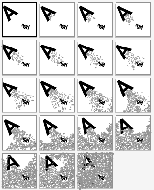
For our first exercise, we are told to draw our name based on our personality. Each student was told to do 10 each. I was confused what personality I should pick, I have a few in mind but in the end, I pick perfectionist. From the start, I feel like going simple is a great route for me, but I do tried a few style at the end. |
| Fig 4.1 sketches perfectionist |
After a few times of trying, I manage to make 10 sketches. After going to class and got the critique I manage to fix them a bit. I transferred everything to illustration and tracing it bit by bit.
 |
| Fig 4.2 Sketches before critique perfectionist |
 |
| Fig 4.3 Sketches after critique perfectionist |
After picking one of 10 design, I remake everything in Illustrator. At first it look really bare, but after a few times taking feedback from Mr Vinod I manage to make a quite decent lettering.
 |
| Fig 4.4 Progress of digitizing perfectionist |
 |
| Fig 4.5 First design for perfectionist before redo |
I'm really not satisfied with what I've done. After long thinking, I decided to change everything including my 10 design.
 |
| Fig 4.6 Sketch for the new design traveling |
 |
| Fig 4.7 Digitize design traveling |
 |
| Fig 4.8 My second design traveling |
I was told to redo my animation because it doesn't fit the personality. Mr Vinod help me pick one from ten of my sketches.
 |
| Fig 4.9 third lettering design traveling |
Animating (week 2)
We were told to do a simple animation for our lettering with adobe illustrator. Mr Vinod and Mr Shamsul teach us how to do a simple animation in adobe illustration and photoshop. First we have to make artworks in illustration but keep in mind that 1 second equal to 24 artwork or frame. Each artwork need to be change bit by bit in illustrator. |
| Fig 5.1 Progress for first design perfectionist |
 |
| Fig 5.2 Progress for the scraped design perfectionist |
I tried doing the animation, turns out the design moved without me knowing. After some feedback, Mr Shamsul, he suggested me to redo it because the movement is very visible.
 |
| Fig 5.3 Final for the scraped design perfectionist |
My idea is to make the planes moving as if like it's flying with the help of the clouds.
 |
| Fig 5.4 Progress of making the animation traveling |
 |
| Fig 5.5 Gif for second design traveling |
After feedback, I was ready to do my animation. I want to make some of the letter move as if they are following the map lines. They have reached their destination when the button pops out.
 |
| Fig 5.6 progress of animating traveling |
 |
| Fig 5.7 Final animation traveling |
Finalizing (week 3)
We were told to do our type expression at home, and ready for class with digitize ready for feedback. Our words that we need to do is, hungry, look, freeze, angry, faint, bounce, levitate. Out of seven, we have to pick 6. I find myself try to search for ideas in the library. From the example that I find, most of them expressed them with how they react with that situation. For example when people 'angry', they curse, and there where my idea came from. We are only allowed to use nine typefamily that was given by Mr Vinod and Mr Shamsul. |
| Fig 6.1 sketches for bounce and levitate. |
 |
| Fig 6.2 sketches for loop, hungry, faint and angry. |
 |
| Fig 6.3 My design before feedback. |
After some feedbacks, I change hungry and levitate completely. I decided that I want to make 'hungry' like a teeth, and make only the 'I' in 'levitate' that levitating. As for 'faint', I was told to have the letter 'i' to drop like a shadow, and the 'p' in 'loop' to face the other way.
 |
| Fig 6.4 My design after feedback. |
 |
| Fig 6.5 My final design with the typefamily. |
Then I ask Mr Vinod, which expression I should pick, and he said 'angry' would be a good choose. He also told me to go beyond the box. I tried doing a demo of my animation in class and this what I come out with.
 |
| Fig 6.6 First animation for demo. |
After seeing the demo, I want the symbols to feel like it come out from the letter A so it feels like the letter A the one who shouts the symbols. I also want to make the letter A to shivers in anger so I make a tiny adjustment every artwork. I feel like I didn't manage to do that with the demo, it looks like the curses just appear, not being shouted.
 |
| Fig 6.7 Progress of animating in illustrator. |
 |
| Fig 6.8 Progress of animation in Photoshop. |
I had problem with putting delays in the animation. This happens because the preview and the end result seems different. The end result seems really fast even when it seems okay from the preview of photoshop.
 |
| Fig 6.9 First outcome before I fixed it. |
 |
| Fig 7.0 final animation. |
FEEDBACK
Week 2I was told that that my fonts needed work, they don't really fit into the personality that I picked. Mr Vinod gave me some ideas that can make the fonts look more like the personality that I picked. After I made it into the illurstration format, Mr Vinod told me that the letters need need more spacing because they are too close with each other. It needed work, he said that I need to work on it at home.
"Update and complete your eportfolio before the next class. Tq"
Week 3
General feedback
Mr Vinod said that even when we were told to complete it at the class hour, he really doesn't expect any of us to complete it right away. He told us, even our senior continue it after class and manage to do it well. We need to polish our skill bit by bit with many exercise so we manage to do well for our project later.
Exercise
Mr vinod said it was okay, but when I animated it, the lettering moved, he ask me to redo it again. I'm also not satisfied with my result so I agreed with him.
Week 4
General feedback
Week 4
General feedback
Mr Vinod gave us a general feedback about the feedback sheets that we have to updated every week. First he said that we should not delete othe people feedback sheets, second is to not change the typeface that already given (Arial 10 points) and number three, do not delete the red text, that is include text or comment from facebook. Please copy and paste everything the lecturer type directly in red colors. we write it black when we transcribing their feedbacks.
Exercise
Mr Vinod said that a few of my design is good, my design in loop is interesting but try to make the letter P the other way around. For bounce, the letter O is an impact so the shapes are wrong. For levitate, the impression is wrong, it looks more floating instead of levitating. For hungry, Mr Vinod likes the change of Y to a fork but I should not make a new art or decoration, I should change the font as well. Mr Vinod say that he like the design in angry and faint.
Today we made a webside for our eportfolio. I feel regretful today, because I didn't bring my laptop, I tried using my phone and the wordpress app but some features aren't available. My solution is to record everything so I can do it at home. I paid extra attention to the lectures so I'll manage to do it at home as well with only the voice recorder guiding me. I also keep looking at my friends doing the task so I know what to do later. I manage to do it in 20 minutes with no problem. After this incident, I always bring my laptop everyday, just to be safe.
Week 5
General feedback
There some problems with the eblog. Mr Shamsul said that please use a font that readable, make sure the formating is correct, no double spacing that make an awkward space. Please use good picture and make sure the instruction is public. Most of the blog is imcomplete and please read books and put it on the further reading. General feedback
Exercise
Mr Vinod said I did a good job at my lettering animation and type expression animation. REFLECTION
Experience
Week 1Today we made a webside for our eportfolio. I feel regretful today, because I didn't bring my laptop, I tried using my phone and the wordpress app but some features aren't available. My solution is to record everything so I can do it at home. I paid extra attention to the lectures so I'll manage to do it at home as well with only the voice recorder guiding me. I also keep looking at my friends doing the task so I know what to do later. I manage to do it in 20 minutes with no problem. After this incident, I always bring my laptop everyday, just to be safe.
I had so much trouble doing today exercise, I've been doing it for the whole week yet I'm not happy with the result, I believe I can get better and grow, with the help around me.
Week 2
We are digitize our work today with Adobe Illustrator. I had trouble making things work with my lettering. I kept asking Mr Vinod for feedback. I'm thankful that I have someone that help me grow.
Week 3
We were told to animate our lettering. I had a hard time doing this because I do not know how I wanted to animate the lettering in first place. I basically just playing around with it and find myself redoing the exercise many times because I don't have plan to begin with.
Week 4
Today we animate our type expression. I couldn't finish it because I ran out of time. I keep revising my work before animating it so it took me quite some time.
Observation
Week 1
I've notice that I am not experience in making lettering, truly a challenging task for me to finish. I hope I can learn faster.
Week 2
I did not revise my work this week. I should have done that but for some reason I didn't and I am not happy with the result either.
Week 3
I kept redoing my exercise, even in some other class. I know it a waste of time, therefore I should have make a clear idea and how I should execute it. I need to get used to it so I can do my job more efficiently.
Week 4
I find myself still confuse with some buttons in photoshop because I never use photoshop for animating. I still can find them, but it took me a few tries.
Finding
Week 1
I notice that I usually go for a safer route when I am not sure of something or some task. I should really challenge myself.
Week 2
I find that I'm most focus when I work alone in my room or in the library.
Week 3
After planning things better, I find myself being more efficient and did not waste a lot of time redoing things completely. I need to keep this in mind and I hope that I can make it into a habit.
Week 4
I find myself rushing things, I should have not done that because my outcome always look bad. I should just relax and take my time bit by bit.
Week 2
We are digitize our work today with Adobe Illustrator. I had trouble making things work with my lettering. I kept asking Mr Vinod for feedback. I'm thankful that I have someone that help me grow.
Week 3
We were told to animate our lettering. I had a hard time doing this because I do not know how I wanted to animate the lettering in first place. I basically just playing around with it and find myself redoing the exercise many times because I don't have plan to begin with.
Week 4
Today we animate our type expression. I couldn't finish it because I ran out of time. I keep revising my work before animating it so it took me quite some time.
Observation
Week 1
I've notice that I am not experience in making lettering, truly a challenging task for me to finish. I hope I can learn faster.
Week 2
I did not revise my work this week. I should have done that but for some reason I didn't and I am not happy with the result either.
Week 3
I kept redoing my exercise, even in some other class. I know it a waste of time, therefore I should have make a clear idea and how I should execute it. I need to get used to it so I can do my job more efficiently.
Week 4
I find myself still confuse with some buttons in photoshop because I never use photoshop for animating. I still can find them, but it took me a few tries.
Finding
Week 1
I notice that I usually go for a safer route when I am not sure of something or some task. I should really challenge myself.
Week 2
I find that I'm most focus when I work alone in my room or in the library.
Week 3
After planning things better, I find myself being more efficient and did not waste a lot of time redoing things completely. I need to keep this in mind and I hope that I can make it into a habit.
Week 4
I find myself rushing things, I should have not done that because my outcome always look bad. I should just relax and take my time bit by bit.
FURTHER READING
The fundamentals of Typography by Gavin Ambrose and Paul Harris.
week 1-2 (05/04/2019-12/04/2019)
There's a lot of things that being covered in this book, but the chapter that I want to cover is the basic of typography because I'm not really good at typography so I want to learn from the start.
Typography terminology is rooted in the printing industry and developed as a means of communicating what can be the very specific piece of information needed to set text.
Typography Design: Form and Communication by Rob Carter, Ben Day, Philip Meggs
week 3-4 (19/04/2019-26/04/2019)
The chapter I want to cover is about Syntax and Communication.
Letter
The intrinsic character of the individual letter is well-drawn form, exhibiting subtlety and precision. It is the unit that distinguishes one family of type from another. It exist in various weights, size, and shapes.
The word
A word have potential to express an idea, object, or event. Word signs are independent of the things they represent, yet by design they can be made to signify and reveal their meaning.
Line
Words are joined to form verbal sentences and typographic lines. The configuration and placement of lines of type are significant structural concerns. A line if type consist of a single point size and a single woight extended horizontally over a specific line width.
Column and Margin
Pages also posses form and counterform relationships due to the interaction of columns and their surrounding spaces. Three specific variables related to columns govern these relationship: the portion of column height to width, texture (the tactile appearance of the type), and tone (the lightness and darkness of type).
week 1-2 (05/04/2019-12/04/2019)
 |
| Fig 6.1 THE FUNDAMENTALS OF TYPOGRAPHY |
There's a lot of things that being covered in this book, but the chapter that I want to cover is the basic of typography because I'm not really good at typography so I want to learn from the start.
- font is the physical means used to create a typeface.
- typeface is a collection of characters , letters, numbers, symbols and punctuation which have the same distinct design.
|
| Fig 6.2 typeface anatomy https://www.behance.net/gallery/33731058/Typographic-Anatomy-Study |
Typography terminology is rooted in the printing industry and developed as a means of communicating what can be the very specific piece of information needed to set text.
- serif/sans serif
- bounding boxes, kerning and letterspacing
- leading
- baselines and typefaces
- typeface characteristics
Majuscule and minuscule, majuscules are uppercase (or capital) and minusciles are lower letter. both of these character sets have distinct application and it is important to note that not all fonts are available in both forms.
- connotation
- font selection
- camellia
- trajan
Typography Design: Form and Communication by Rob Carter, Ben Day, Philip Meggs
week 3-4 (19/04/2019-26/04/2019)
 |
| Fig 6.2 TYPOGRAPHY DESIGN: FORM AND COMMUNICATION |
- Syntax: manner in which words are combined to form phrases or sentences.
- Typography syntax: the process of arranging elements into a cohesive whole.
The basic of syntax include:
- unit
- letter
- progresses to word
- line
- column
- margin
The intrinsic character of the individual letter is well-drawn form, exhibiting subtlety and precision. It is the unit that distinguishes one family of type from another. It exist in various weights, size, and shapes.
The word
A word have potential to express an idea, object, or event. Word signs are independent of the things they represent, yet by design they can be made to signify and reveal their meaning.
Line
Words are joined to form verbal sentences and typographic lines. The configuration and placement of lines of type are significant structural concerns. A line if type consist of a single point size and a single woight extended horizontally over a specific line width.
Column and Margin
Pages also posses form and counterform relationships due to the interaction of columns and their surrounding spaces. Three specific variables related to columns govern these relationship: the portion of column height to width, texture (the tactile appearance of the type), and tone (the lightness and darkness of type).

Comments
Post a Comment