01/04/19 – 12/06/19 (Week 1 – Week 14)
Arletta Leviani (0337751)
Design Principles
Final Project
27/06/19 - 12/06/19 (week 13 - week 14)
We are now on our last project, which is our final project. We are told to get inspired by our surrounding billboards to do this project. We are given freedom to use any media but our inspiration billboard need to come from our own surrounding, not internet's billboards. So on our first meeting, we are told to look around for billboards. Since I have class on Wednesday and Thursday, I need to get some billboard on Wednesday, I manage to get some on my way walking back home.
 |
| Fig 1.1 APU billboard |
When I got my billboard the first thing I did is to analyze them by their design principles. Most of their work is using
contrast to get people attentions and
hierarchy of some information they want to highlights. But after I analyze all of these I can't get inspired yet so I tried to see some billboard online that actually local in my area. Ms Sherry told me to get my own picture and that day I actually planning to go out to Sunway Pyramid using the bus to print something and I took the opportunity to get more billboards on my way there. I manage to get a lot more billboards and once again analyze them.
 |
| Fig 1.2.1 billboards taken by me |
 |
| Fig 1.2.2 billboards taken by me |
 |
| Fig 1.2.3 billboards taken by me |
 |
| Fig 1.2.4 billboards taken by me |
 |
| Fig 1.2.5 billboards taken by me |
 |
| Fig 1.2.6 billboards taken by me |
 |
| Fig 1.2.7 billboards taken by me |
 |
| Fig 1.2.8 billboards taken by me |
One particular thing that I noticed when I analyze the billboard I tend to focus on the writing which I don't want to. So I start to focus more on colors and images, and try to understand what the billboard are trying to say. I found a juice ads that promote their brand by saying they are using real fruits in their juice and smoothies. I found that it's really interesting how they market a brand by saying what they are made of and how they made it, so I tried to go by that directions in my drawing.
|
| Fig 1.3.1 billboard that inspired me |
|
| Fig 1.3.2 billboard that inspired me |
My idea is to express how something is made, with what media, tool or items used to make something. I want to express something that is part of my culture which is batik. For final I decided to do traditional art because I don't really express much of my skill in free drawing in this semester. I rarely do traditional art because some reasons, and this reason actually happens in the making of this final.
My idea is to make a girl that doing progress of the batik. I tried to make add some design principles in my drawing. I start with a simple shapes to help me figure out the composition first and I continue with that. I start to shade with my pencil since I want the girl to have a black, white and grey as their colors. I also notice that making traditional art, you need to make sure your eye have the same level to your artwork.
 |
| Fig 1.4.1 Progress 1, basic shapes |
I start with the hair to shade, I make sure to have some few single lines in the artwork so indicate a few hair strings. I use 3 different pencil, 2B, 6B, and 8B but I mostly use 2B and 6B to shade. I don't use HB and B because they are too hard for me too use and they don't give the intense color that I wanted. One that I'm afraid is to start shading. Since I do it traditionally the color intensity will changed when I scan it, so I need to make the shade really dark and noticeable.
 |
| 1.4.2 pencil that I use |
 |
| Fig 1.4.3 Progress 2, hair shading |
 |
| Fig 1.4.4 Progress 3, hair shading |
 |
| Fig 1.4.5 Progress 4, hair shading |
 |
| Fig 1.4.6 Progress 5, hair shading |
 |
| Fig 1.4.7 Progress 6, face shading |
After I am done with shading, I notice my hair shading go smudge while I shade the face. It is a common thing that happens and I do minimize the smudges by using tissues under my hand. But it still does that. This is one of the reason I rarely do traditional sketches, I got frustrated when my detailed shading got smudged. After that I color my batik, I tried to make contrast by using color. Batik has different way to made, the one that I draw is batik canting.
 |
| Fig 1.5 batik canting |
Batik canting has a lot of detail because of the tool used allowed us to make a lot of small details. To replicate that, I use marker to make dots for the flowers. I color the base batik color brown because it is the common color of batik. I use Faber-Castell color number 399, 378, 376.
 |
| Fig 1.6.1 3 color pecils that I use |
 |
| Fig 1.6.2 Progress 7 coloring batik |
 |
| Fig 1.6.3 Progress 8 coloring batik |
I draw the tool that use to make batik. The tool is called canting, therefore the batik is called
'batik canting'.
 |
| Fig 1.6.4 canting as reference |
 |
| Fig 1.6.5 Progress 9 coloring batik |
|
 |
| Fig 1.6.6 Progress 10 coloring batik |
|
 |
| Fig 1.6.7 Progress 11 coloring batik |
|
 |
| Fig 1.7 final artwork |
Principles that I tried to achieved:
- Pattern: I want to make pattern from the batik. The batik pattern is a 'S'
- Repetition: From the pattern of batik, repetition was made.
- Lines: To make the shading, I use the technique called cross hatching, the shadows are made by lines made.
- Dots: Batik canting has a lot of details because the tool allowed them to do that, most of the batik were made by dots. I tried to replicate that by using dot technique to color the flowers.
- Contrast: I want to make contrast between black, white and grey with the colors of the batik so the viewer will see the batik first before anything else.
- Hierarchy: the first hierarchy is the batik, it is possible because it is the only one with colors while the rest is black white and grey.
Feedback
I emailed Ms Sherry and she said that she likes the add of colors. Ms Sherry also love how I made the hair look shiny.
Project 2 - Sense of Place
13/06/19 - 26/06/19 (week 11 - week 13)
We are now doing our second project with a theme of sense of place. The idea is to make a composition that represent any place. The place is strictly place that we are familiar with but with one rule from Ms Sherry. She said that it would be better if the place is near so we can come there often to see the atmosphere of the place in different time of the day or the week.
We are allowed to use any media to do this but Ms Sherry also hope that we can use the principles that we covered from the exercises to do this. I decided to use Adobe Photoshop. The reason I decided to do this is because I am familiar with this media the most so I can focus making the composition great.
 |
| Fig 1.1 Example 1, New York |
 |
| Fig 1.2 Example 2, a work place |
I have a bit of struggle picking a place, because I'm new at the area, I don't really have a place I'm really familiar other than my classrooms. I have a few place in mind, but I decided to make a sense of place from the drawing studio at building D at Taylor's University Lakeside campus.
 |
| Fig 1.3.1 photo that I took |
 |
| Fig 1.3.2 photo that I took |
 |
| Fig 1.3.3 photo that I took |
 |
| Fig 1.3.4 photo that I took |
 |
| Fig 1.3.5 photo that I took |
 |
| Fig 1.3.6 photo that I took |
 |
| Fig 1.3.7 photo that I took |
 |
| Fig 1.3.8 photo that I took |
 |
| Fig 1.3.9 photo that I took |
 |
| Fig 1.4.0 photo that I took |
 |
| Fig 1.4.1 photo that I took |
 |
| Fig 1.4.2 photo that I took |
Some of these pictures couldn't make it to the end artwork. These are the progress, first I put some pictures that I want to add in the artwork. 1 is the stacks of paint on the corner of the room, yellow rope to hang artworks, and a metal paper drying rack. I decided to make the stack of paint sideways even when the artwork is portrait to give an usual feeling to the composition, also to give balance for later since I want to add some more pictures on the right side.
 |
| Fig 1.5.1 progress 1 |
I add a bit more of the bottles at the back and added blending modes to give a bit more effect of perspective and as if there's a lot of bottles of paint. I also added a bit of texture of paint from the studio's desk.
 |
| Fig 1.5.2 progress 2 |
I want to add a letter from a foundation student that was left on a table. I want to add the typography on the artwork but I don't want to overpowered the rest of the other elements.
 |
| Fig 1.5.3 progress 3 |
I use a blending mode 'pin light' to get rid of grey background. I made another copy and move it a bit to give an impression of movement or shadow.
 |
| Fig 1.5.4 progress 4 |
I add a cool/blue grey to compliment the color of the place, a bit of pinkish to make the surrounding look warmer. The room overall color is grey so I tried to copy the cool colors.
 |
| Fig 1.5.5 progress 5 |
 |
| Fig 1.6 final artwork before feedback |
Progression animation:
Principles that I tried to achieved:
- Balance: having items on the left side of composition, I tried to give balance on the right part of the composition by giving huge typography. I also add yellow ropes that give a bit of balance on the top of the composition
- Texture: since the room have a lot of texture left behind by students from paint and cut pieces, I want to replicate them and adding them to the composition.
- Contrast: I used a lot of saturated color for the paint to give contrast from the rest of the composition. The idea come from the colorful paint that contrast from the rest of the room color that more grey and dull.
Feedback
Ms Sherry said that she I did a good job of capturing the design room. I manage to give the room expression well with the color. She likes the typography that I added.
Project - Self Portrait
22/05/19 - 12/06/19 (week 8 - week 11)
We are starting our self portrait for our project. We are allowed to use any media, digital or manual artwork is also acceptable. We started our project with some example from Ms Sherry. She showed us bunch of example from famous artist from the past and some digital art as well.
 |
| Fig 1.1 example 1, by Vincent Van Gogh |
 |
| Fig 1.2 example 2, by unknown |
I want to do digital art from the start and I decided to play around with what I'll do. I use Paint Tool SAI to make these.
 |
| Fig 1.3 Paint Tool SAI |
 |
| Fig 1.4 Paint Tool SAI work place |
My first attempt is to make something that's really dark, something I'm not really used to and I had a really hard time expressing those. I'm not familiar with the colors and the colors combinations and the composition seems odd to me.
 |
| Fig 1.5.1 First attempt, Sketch |
 |
| Fig 1.5.2 First attempt, base colors |
 |
| Fig 1.5.2 First attempt, Shadows and highlight |
 |
| Fig 1.5.3 First attempt, Details and added more shadows and highlight |
At this point I started to feel that this won't work. One because it looks like a floating head and I don't think the compositions looks pleasing. Another thing I just realize is my proportion is off. But for no reason, I still keep going and try to improved this.
 |
| Fig 1.5.4 First attempt, my attempt to fix this |
 |
| Fig 1.5.4 First attempt, I gave up at this part |
I decided to remake this again with different composition. I ask my friend what kind of a person I am. My friends from Malaysia said that I'm caring, but they are not fully sure because they just know me. I start to ask my best friends from Indonesia as well, I've been friends with them for 7 years and hope to find new things. And they said the same thing as well. So my main points I want to put on my drawings is that I'm caring, I looks at a positive side of a problem and imaginative. I started with simple sketch first.
 |
| Fig 1.6.1 My second attempt, sketch |
I then add base colors to see the feeling of the artwork. I choose all the colors that I love, yellow and blue. In the color wheel, yellow and blue is on the other side of each other, so they gave a bit of contrast. Sometimes they don't go well together if you choose a wrong kind of blue, I make sure to choose warm blue to tie it with the color of yellow.
 |
| Fig 1.6.2 My second attempt, base colors |
Then I proceed on giving light and shadow to give volume. When I do shadows, I don't use a darker color of my based (grey color). I always choose a more red or bluer colors from the based color (purple or red). If I use the grey colors, my artwork will look dull.
 |
| Fig 1.6.3 colors for shadows |
 |
| Fig 1.6.4 My second attempt, shadows and highlight |
 |
| Fig 1.6.5 My second attempt, colors and highlight for clothes |
For making hair, even when I have a black hair, I don't use pure black to color. Reason is because when you use pure black, the color will look like a dark brown instead of dark black that you intended in the first place. I use dark blue and purple for the hair. Even when it is not pure black, the illusion makes it like a deep black colors.
 |
| Fig 1.6.6 dark colors |
 |
| Fig 1.6.7 My second attempt, shadow and highlight for hair |
When I started this piece, I don't think the body pose is a problem. But after a while I notice how it look flat and not really interesting. I change them several times.
 |
| Fig 1.6.8 My second attempt,changing the body poses |
 |
| Fig 1.6.9 My second attempt,changing the body poses |
This time I'm trying to make the composition works since I edit them several times. I decided to make the person smaller to make space for the fishes later.
 |
| Fig 1.7.0 My second attempt,changing the overall scale |
After several times of changing my poses, I manage to make something that fit. The pose and the face actually face different way to make the composition interesting.
 |
| Fig 1.7.1 My second attempt,changing the body poses |
 |
| Fig 1.7.2 My second attempt, body pose direction |
 |
| Fig 1.7.3 My second attempt, clothes folds and highlights |
I make the background fit the drawing by 'painting' the background as well. I also add light direction from the right to fit the highlight from the clothes and face. I add more harsh shadows to the clothes to fit the light directions. For the light, I made the 'white' using light blue instead of pure white to fit the colors that already establish, to tie everything with the person, I added a bit of yellow and red so they all fit together as one piece of artwork and not different pieces.
 |
| Fig 1.7.4 My second attempt, light and shadow direction for background |
Then I add fish. The fish I have chosen is goldfish to indicate imagination. Goldfish is use to indicate imagination or day dreaming for some people. I decided it suit the things I want to achieved. I'm no expert at drawing fish so I use some references.
 |
| Fig 1.7.5 Fish reference 1 |
 |
| Fig 1.7.6 Fish reference 2 |
 |
| Fig 1.7.7 Fish reference 3 |
 |
| Fig 1.7.8 My second attempt, Adding fish. |
Explanation:
The gold fish represent day dream or imaginative, the person looking at the light means I'm the kind of person that look into a positive side of a problem and try to find a solution of it. I didn't make eyes because even when I'm not seem like I'm looking at everything that I just state, I'm still do. All the colors is my favorite colors, yellow and blue.
 |
| Fig 1.7.9 My second attempt final |
 |
| Fig 1.8 Progression gif |
Principles that I use to achieved this:
Balance
I want to make a balance from the person and the fish. If I didn't use the fish, the balance will be off. I also make balance from the colors. I use warm colors but make a balance with the blue and red. To make a balance from detailed painting of the person and fish, I made a big simple color background.
Scale
I made a scale from different between the fish and the person.
Texture
I know that making texture using digital art is quite hard because the printed paper will be flat later on, therefore I tried to challenge that. I make some texture with a texture brush and not blurring my color between shadows. The texture also help given more volume to the artwork. I believe I manage to achieve this since some people think it is an acrylic art piece.
Contrast
The contrast between the color yellow and dark blue I chose for this. The color yellow that put around the color blue making it looks a lot brighter and stands out.
Movement
The movement from the fish tails and body movement gives a feeling that the fish are swimming around.
Feedback
Ms Sherry said that she likes the movement of the fish. She thought I use watercolor or acrylic to do this. This makes me happy because I want to achieved texture from digital art. She likes how it looks happy. For my blog, Ms Anis told me to make sure to put all my feedback and the principles I would like to achieved in this.
Lecture 7: Harmony, Rhythm, Movement
30/05/19 (week 9)
Lecture Notes
Rhythm is a pattern with movement. To achieve rhythm, we can use 3 methods, repetition, alternation and progression. Rhythm is important to introduce interest, focus, and help with eye movements.
- Repetition: one of way to achieved rhythm by repeating line, color, texture, patern, light, scale and proportion.
- Alternation: one of way to achieved rhythm by alternating 2 or more elements in regular pattern.
- Progression: one of way to achieved rhythm by gradation of color, or a series of objects that start small and become large.
Harmony can be described as sameness, the belonging of one thing with another. The repetition of similar or related elements like
- Adjacent colors
- Related textures
- Similar shapes
 |
| Fig 8.1 Color wheel |
Harmony helps bring our unity, but all harmony and no contrast can make a composition looks monotonous. Balance is needed in harmony.
Movement is the part the viewer's eye through the work of art, often to focal areas. An artist controls and forces the progression of the viewer's eyes in and around the composition of the painting using eye travel. Movement can be directed with,
- Lines
- Edges
- Shapes
- Colors
Movement also to show action and created a feeling of motion in a composition.
Exercise
Today we are making a collage. I rarely done one so I'm having a hard time doing this week exercise. I have a few attempts, in my first attempt, I'm inspired by this photo. I really like the way it shows the athlete movements.
 |
| Fig 8.2 Inspiration for first attempt |
I start searching for sport or athletes pictures but I can't find one on the news paper I have. My option is limited so I use my cereal box to do this.
 |
| Fig 8.3 Cereal box used as material |
I tried to make movement with the soccer player to indicate the player's feet movement. I use some magazine papers with some red and green to hope make eye movement to the player, also gives an impression of movement of the soccer player feet.
 |
| Fig 8.4 attempt 1 |
After finishing it, I feel like I can't achieved what I wanted from the start. I decided to find more inspiration and find a collage photographer named David Hockney. He's a painter that start began creating intricate photo collages that he called “joiners”. His earlier collages consisted of grid-like compositions made up of polaroid photographs. He then switched to photo lab-processed 35mm photographs and created collages that took on a shape of their own, creating abstract representations of the scenes he had photographed. The varied exposures of the individual photographs that make up each collage give each work a fluidity and movement that otherwise might not be found.
 |
| Fig 8.5 Inspiration by David Hockney |
 |
| Fig 8.6 Inspiration by The Beatles Road Walk |
I really like how he make movements with photography so I decided to go with that direction. I have this brochure that sell clothes. I notice that the catalog poses are similar and I decided to cut them to see if I can make a movement from them.
 |
| Fig 8.7 The brochure for my material |
There actually different sizes of these pictures. I want to use the bigger pictures because I can see them better in A4 paper. But I notice that there are more the amount of little pictures than the bigger one. I can make a more strong movement this way.
 |
| Fig 8.8 Cut pictures with different sizes |
 |
| Fig 8.9 First collage with bigger pictures |
I decided to use the smaller picture and try to make a movement with each pictures. I manage to come out with this.
 |
| Fig 9.0 My first attempt to make a movement with smaller pictures |
I found more pictures that can be added on the collages and I manage to put this.
 |
| Fig 9.1 My final movement |
After I put everything together, I notice the composition is really empty. I decided to add some magazine page on one side of the paper to make it seem like the person is walking out. Other than movement, I want to make a rhythm of the person.
 |
| Fig 9.2 Final collage |
Feedback
Ms Sherry said that she interested with how I made my movement of the same person with different clothes. She likes that I manage to make a movement out of a brochure. She also likes the way the letter O is on the top of the person, it looks like a ball.
Gallery Visit: Ilham
29/05/19 (week 9)
Chia Yu-Chian is a Malaysian artist that
was born in 1936 and his 200 work has been hanged on a solo exhibition with
almost 200 artworks, mostly from the family collections.
 |
| Fig 7.1 Chia Yu-Chian |
In his paintings that showed in the museum, most
of them are made by oil paint, except for his sketches. His media is canvases
and boards, but they are sharing the same unique contrast between colors. What
I like the most about his paintings is he is not afraid to use colors; his
painting is colorful and vibrant. His artwork is mostly an old days of Kuala
Lumpur, from open market, his hospital visits to his
favorite restaurants, they gives a lot of nostalgic feelings.
He also paints a lot of perspective surroundings. Mostly for buildings
but with great details, he also paints them with different background, culture,
races, ages and jobs. For example, Hup Seng Kedai Kopi that he paints.
 |
| Fig 7.2 Hup Seng Kedai Kopi |
His paintings are well balance, he manage to
bring balance in his vibrant paintings with cool colors as his backgrounds like
cold blue and cool white. Other than balance, he also gives texture in his
artworks. When he uses the board as media, he use the back of his brush to make
lines of textures.
 |
| Fig 7.3 Texture in artwork |
The center piece of the gallery is the
huge painting named ‘A Splendid Victory’. The artwork is made by board and oil
paint. The harmony of colors is really good, it complement every color he put
there.
 |
| Fig 7.4 A splendid Victory |
Photography gallery of different
artist is displaced on the third floor. Most of them are old photos of black
and white, and if you see then in a glance you can really tell the difference.
But each photograph has different content of what the photographer wants to
achieved and delivered.
This people in these pictures are monks that are curious what they will
look like wearing formal clothes. Back then editing program, like Adobe
Photoshop doesn’t exist, so making these pictures is really hard to do.
 |
| Fig 7.5 Edited photography of Monks |
Lecture 6: Dots, Scale, Lines, Size
15/05/19 (week 7)
Lecture Notes
Dots is the smallest and most basic element of design. Designing with dots can create a wide variety of visual effects. There are various associations that can be made with positioning a single dot in different areas of a page.
It is use for:
- Creates textures
- Optical illusion
- Pointillism
- Makes vivid and stimulating effects through combination of different sizes.
Line is a path traced by a moving point.
Types of lines:
- Actual lines
- Implied lines
- Geometric lines
- Origanic lines
- Horizontal lines
- Vertical lines
- Diagonal lines
Size is how big or small an element is in relation to other objects. Simply the relationship of the area occupied by one shape to that of another. It is used to convey important, attract attention and create contrast ans to make a particular element stand out or give it importance
Exercise
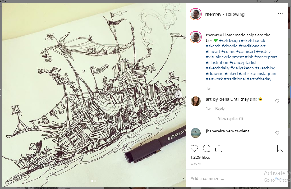
My inspiration for this week is from an amazing animator,
Edwin Rhemrev. He make beautiful artwork using pen and watercolor for shadows. He make a lot of videos of his progress of sketches for learning purposes.
 |
| Fig 6.1 Inspiration 1, artwork by Edwin Rhemrev |
 |
| Fig 6.2 Inspiration 2, artwork by Edwin Rhemrev |
 |
| Fig 6.3 Inspiration 3, artwork by Edwin Rhemrev |
I was really scared doing this particular sketch because I am not used to it. I decided to make myself comfortable with my pen first. The tool that I use is Pigma Micron. I have two sizes, 0.5 and 0.1. I eventually use 0.5 because 0.1 is too thin for me.
 |
| Fig 6.4 Pigma Micron |
 |
| Fig 6.5 Pigma Micron 0.5 |
I use a bit of color to give out the feeling of shadows. I use Miniso Aquarelle Brush number 31101. There are 2 tip given in one pen, One is fine tip and the one I used is brush tip.
 |
| Fig 6.6 Miniso Aquarelle Brush number 31101 |
First I make a base sketches to guide me when making detailed face. I made a simple circle to start with. Sketches with pen is unique, the guides is also part of the final artwork instead of usual pencil sketch that erased after artline. Sketches doesn't have to be too thick because the purpose of making it in the first place is to help guiding.
 |
| Fig 6.7 Sketch base |
Sketch base helps in making chin, mouth, forehead, nose and eyes. Because my drawing is a random person from my imagination, my guide is based on the 'perfect face'. The length between forehead to chin is divided into 3. 1/3 is chin to nose, 1/3 nose to nose bridge, 1/3 nose bridge to hair line.
 |
| Fig 6.8 Base sketch |
Making a basic face features with the help of the guide lines. I make big shapes to form the features first before adding more details.
 |
| Fig 6.9 Basic face features added. |
After making shapes, I make a more heavy lines to give more difference between sketch and final lines. I decided to use colors to add more depth and shadows.
 |
| Fig 7.0 Giving more detailed lines |
 |
| Fig 7.1 Final work 1, after giving a little color for shadows. |
 |
| Fig 7.2 Final work 2 with the same progress. |
Feedback
Ms Sherry said that she likes the fact that we use different style and way to draw. She love that tried to challenge myself.
Reflection
Experience
It is hard to start a piece of art when you're not used of making sketch with pen. I rarely use pen to do lineart, so it is twice harder for me. After a while, I manage to gain enough confidence to make a full artwork with pen.
Observation
Changing style to sketch is really hard and sketching in pen is harder. I need to be really confident in my strokes or I will make a lot of mistakes. Having confidence in the strokes giving a better outcome.
Finding
It took me a few tries to make a new artwork with a way I am not used to. I notice that when I hesitate to make the lines, I more often I mess up.
Lecture 5: Perspective, Alignment, Hierarchy
8/05/19 (week 6)
Lecture Notes
Perspective is an illusion of depth in a picture. It have several type
- one point perspective
- two point perspective
- three point perspective, bird eye view or worm eye view
- four point perspective
It can be achieved by putting different size in the picture, color, texture or overlapping object.
Hierarchy is the order of a user to process an information on a page. It can be form as a big text that make the user read that word first. Factors that effect hierarchy is color, size, proximity and contrast, repetition, texture, white space.
Alignment is also important because our eyes tent to find the alignment in a picture or photos. It can be vertical or horizontal, left, right or center alignment. A triangle is also important to show hierarchy, the top is going to give more impression that it's more important than other. Direction give a feeling of a composition, for example, diagonal direction gives you a feeling of movement.
Exercise
Feedback
It is good. Ms Sherry said that she likes my alignment photo most out of 3.
Reflection
Experience
We took a lot of photos on the campus but I also use some old picture as well.
Observation
I find that taking pictures are really hard.
Finding
Some pictures better standout more in black and white and some picture looks better in colors. The use of black and white usually to brings out texture better,
01/05/19 (week 5)
No lectures because labor day, we got critique section on Thursday for our pattern design.
Lecture 4: Pattern
24/04/19 (week 4)
Lecture Notes
Pattern is a repetition of design elements, it can be
- seamless: never ending, you can not see where the pattern start or stop.
- finance: can see where the end of the pattern that continued with a different pattern.
Pattern can be use for grasp your intention and explain rhythm. Pattern can be used in many different way, it can be use for tiles, clothes or fabric.
Principals of repetition
Repetition is using an an object or shape repeated. The idea is to make the design looks unity, consistency, and cohesive. Pattern and repetition have a very close bond with each other. A design can only be called pattern when there's repetition of another element or object.
Exercise
For the exercise, we are doing vegetable stamp. The idea is to make a shape using from the vegetables like carrot or potato. Ms Sherry is not really give any rule to what kind of stamper we use, but we have to stamp them, not to draw them. My first idea is using styrofoam because it is easy to shape and cut. The paint I use is watercolor, but I wont use too much water so it won't bleed and make the stamp shapeless. At first I kept using making my own shapes with styrofoam, I make a few tries to know how thick the paint needed to form a shape before it become too clumpy or how thin the paint before knowing it will bleed and shapeless.
 |
| Fig 5.1 first few tries using styrofoam |
After tries and error I made my first design, I'm mainly using primary color, but I found that the colors doesn't fit together.
 |
| Fig 5.2 first pattern with mostly primary colors |
Other than the colors doesn't fit together, I feel like there's too many white in the design. It make the design looks empty. I tried too give more colors to the background, but it seems like it still looks too empty.
 |
| Fig 5.3 Second pattern still mostly using primary colors |
I tried different way doing stamping, I tried using rubber band that I cut to half to create a splashing and whip effects. After a while using the same technique, the design feel so heavy with too many colors.
 |
| Fig 5.4 Third pattern using rubber band |
After feeling that it will not work, I start thinking using another things. Orange is one of the things I wanted to use. After cutting it to half, I found that the orange juices will leek and make the paint sheer to the point that it hard to use and the pattern shapeless. I tried using tissues to fix this problem and it seems like it won't work. My first solution is to air dry the orange but I'm afraid that it will go bad if i leave it overnight. So my solution is to cut some of the fruit meat enough to only show the shape of the orange. I also use a thicker paint to balance the fruit juice and to make sure to only paint the fruit shape, not the fruit meat so the shape is can be transferred to the paper easier. For the background texture, I use kitchen paper towel. I use the opposite colors to make the orange pop more, but I use warm blue so the colors still blend together. I use the end of the orange skin to make the smaller circle.
 |
| Fig 5.5 Fourth design using orange and paper towel |
I tried making a gradient for the background for the next pattern. I still want to use the same fruit so making the background different makes the design look different. The fourth design look more calm from the color of blue, so I use mostly purples in the next design to make the design warmer.
 |
| Fig 5.6 Fifth design with different colors |
For the last design, I use orange skin that have pores on it. I paint it with some colors and roll the fruit across the paper.
 |
| Fig 5.7 Sixth design with orange skin texture |
Feedback
Ms Sherry said that my pattern is good. The pattern is already good by itself but she like that I add more texture at the back. My choose of colors makes my pattern pop more, my gradient making the orange pattern stronger.
Reflection
Experience
I had a hard time picking what item I should use to stamp. Using a certain item need a certain way of stamping to bring out the best shape of it.
Observation
Using a fruit and vegetables for stamping is different from using solid objects. Fruit have juice that effect the paint, the paint will get too sheer and can't hold it shape too well. Certain vegetables are fragile, you need to be careful when stamping, but not too light when stamping because the shape won't come out well.
Finding
There's a lot of ways and item to stamp.
Event: Future Imaginings
20/04/19
 |
| Fig 4.1 FUTURE IMAGININGS |
At 20 April 2019, 3 guesses come to talk about their projects and job. The 3 guesses all have different project and their approach of art. It is really fascinating to see their field of work all different. One play with wires to make accessories such as earrings or head pieces. One using interactive media to do give information and marketing. And last using future imaging to make an architecture design.
 |
| Fig 4.2 Interactive media presentation |
 |
| Fig 4.2 Q&A section |
Lecture 3: Balance
17/04/19 (week 3)
Lecture Notes
For the next classes, we are going to get lectures from our classmates. My group goes first. Balance is the distribution of the visual weight of objects, colors, texture, and space. If the design was a scale, these elements should be balanced to make a design feel stable.
 |
| Fig 3.1 powerpoint slide about balance |
There's 2 kind of balance
Symmetry is when one side of the design is the same with the other side, so it can be archived by putting objects or elements on either sides of the design so they are equally weighted. It is usually made so the design look structured and rigid, and the viewer can see the design equally.
Asymmetry is when one side of the the design is different from the other. It is purposely done so the viewer focused one one side or one element. This asymmetry balance can be achieved in a few way.
- color: by using 2 kind of colors. vibrant and neutral colors, the design can be more balance.
- value: it refers to the darkness or lightness of objects. Black against white has a much stronger contrast
than gray against white.
- shapes: Large flat areas without much detail can be
balanced by smaller irregularly shaped objects since the eye is led towards the
more intricate shape.
- texture: Smaller areas with interesting textures (variegated light and dark, or random fluctuations) can balance larger areas with smoother, untextured looks.
- eye direction: Your
eye can be led to a certain point in a picture depending on how the elements
are arranged. If the people in a picture are looking in a certain direction, your eye will be led there as well. Elements in a picture, such as triangles or arrows, will also lead your eye to look to a certain point and maintain the balance of a picture.
Exercise
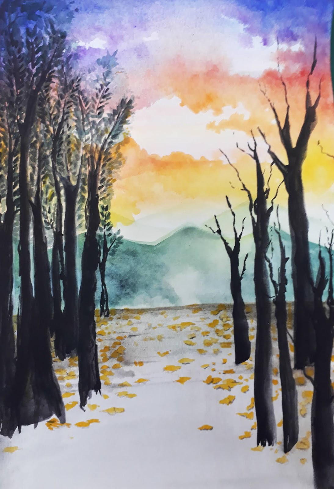
For this exercise we are only allowed to use watercolor. I was really confused of what I should do because balance is really well spread and unlimited. For a few of my sketches, I was thinking too hard of what I should make. After a while I just do what I usually do. I just improvise with a basic idea I have had in mind. Since I miss my hometown, I decided to draw a view from the mountain. My hometown is surrounded by mountains, even when I'm only at the 3rd floor, I still can see them. Whenever I did painting, I always work from behind to the front. So I did the sky the very first.
 |
| Fig 3.2 First inspiration watercolor sky |
I started with a technique wet on wet. You wet your paper first and add colors after. The technique allows you to make a gradient in only certain area you wet your paper and also gives a very specific outcome, colors at the edge hold more color then in the middle. At first I made my color pretty sheer and let it dry. After dry I did the same technique but I didn't wet the area I wanted it to be the clouds. The outcome turns out good but there's a bit of bleeding since I'm in a hurry and the paper still a bit wet.
 |
| Fig 3.3 Progress on sky and clouds |
After that I did the mountains. I did it with a technique name wet on dry. I paint the colors right away on the paper because I want the mountains have different opacity instead of them blending all together. I made the ground with the same technique as the sky and start making the trees. I really want the trees to be very expressive so I didn't do any sketch and let it a bit messier than I usually do.
 |
| Fig 3.4 Progress on mountain, ground and trees |
After I made the trees on one part of the paper, I decided to make some more on the the other.
 |
| Fig 3.5 Progress on right side of trees |
I want to add more details and I put some dead leaves and shadows to finish the work.
 |
| Fig 3.6. Final piece |
Feedback
I was told that the drawing is really good, the way I draw it is really inviting. They also say that they really like the clouds made.
Reflection
Experience
I rarely do watercolors because it really took the whole day to do. Some technique require me to wait the paint to dry.
Observation
I should have bought a better watercolor paper or at least one that weigh more. The paper I use doesn't hold water well and when I want to wet a big part of the paper, the other side already dry. The paper also made some colors more sheer even when I put more colors that I usually do.
Finding
I found that I need more patience doing watercolors.
Lecture 2: Gestalt
10/04/19 (week 2)
Lecture Notes
On the second lecture, we are talking about gestalt, it is the use of negative space so an object can seems to appeared even when there's no exact line around those shapes. It's happened because our brain and vision work together to fill the negative space therefore a picture or shape appeared. After that Ms Sherry shows us example of gestalt from our senior and some logos of famous company. Ms Sherry also ask us if we want to do the critique session on Wednesday or Thursday, most of the classmate want the next day so we did.
After everything cleared, Ms Sherry told us to divide our class into groups for our weekly presentation. Each group should cover some design principles every week to other class mates with some rule that you are not allowed to use google. She also hope that we can find some Asian artist as an example for those principles.
On the next day we did our critique session in different class so we can see other works better. I personally love it the session, I can see others idea and how they come out with it. We are listening to other explanation and everyone did an amazing job.
Exercise
We were given task to make an exercise gestalt with black markers. I truly having a hard time doing this exercise, I even change my design more than 3 times. at first i really want to make a tiger because the stripes were really interesting.
 |
| Fig 2.1 first idea |
I like the idea but I decided to redoing it again since it does not come out as I wanted.
 |
| Fig 2.2 Second idea |
My second idea is using the branches and tress to make the tiger's head and a rock to make the tiger's mouth. But after a few tries, I feel like I can't really see the tiger and it is not truly defined. I tried for the last time using the tiger idea.
 |
| Fig 2.3 Third Idea |
For the last attempt I want to make a whale inspired bu the movie the Life of Pi. Other than the tiger and whale, I want to make the boat as well. After trying using tiger as my main attraction seems too much for me, I decided to change my design completely.
 |
| Fig 2.4 Inspiration for final design |
Having two heads to define each other features seems really cool for me, but I found some problem making it. It's because I need to make sure both heads can be seen and defined easily but doesn't lost it features from each other.
 |
| Fig 2.5 Inspiration for final design |
I was thinking who I should draw. It is because I want both head to come from the same series or movie. I decided the duo Tintin and Hadock is a good choice, so I search for their features. The next problem I had is Hadock's nose is quite hard to put in the design. At the end, Tintin look like he's opening his mouth due Hadock's nose.
 |
| Fig 2.6 Final design |
Feedback
I was told that my gestalt is not that strong, the design was okay, Ms Sherry can see both of their heads, but not a great gestalt.
Reflection
Experience
I always have a problem coming up with an idea and I keep redoing them even when I have limited time to do them. I should just stay with one design and perfecting it instead of making many but none of them come out good.
Observation
Sometimes I 'm searching for ideas for the whole 2 to 3 hours in the library and come back with a blank paper and zero idea.
Finding
I notice that I usually go for a safer route when I am not sure of something or some task. I should really challenge myself.
Lecture 1: Briefing
03/04/19 (week 1)
Lecture Notes
We meet our lecturer, Ms Sherry and Ms Anis on our first class. We are had a briefing and some activity that Ms Sherry prepared. She made us interview our new classmates and draw their faces. After that we hang our artworks and have a critique section. She said that we are going to have a critique section every week for our assignments.
After a 5 minutes break, she continued the class with a lecture about contrast. We were given some example and were asked to say some of the contrast that we can see in the examples.
Example of contrast that can be use:
- Colors
- Shapes
- Texture
- Angles
- Movement
- Font
- Size
- Rhythm
- Integration
From those examples, we were given an exercise based on color contrast, for example contrast between black and white, red and white, but we only allowed to use black and white paper, and no other things like black markers.
Exercise
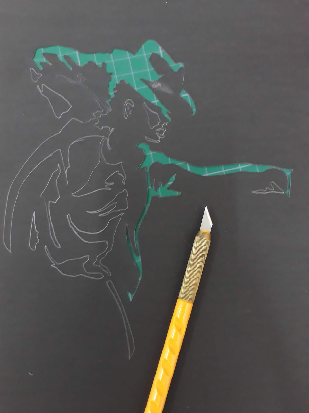
On our first class, we were given an exercise for contrast. We are told to use black paper and cut them into a shapes based on a design that we have chosen. At first I want to draw a penguins because their nature colors are black and white.
 |
| Fig. 1.1 First design |
After it’s half done, I feel like it’s not as clean as I wanted it to be. I decided to redo everything including the design. Turns out the blade wasn't sharp so I change it and I manage to do it pretty well.
 |
| Fig 1.2 first inspiration for second design |
 |
| Fig 1.3 Second inspiration for second design |
I see Michael Jackson on google and thought of my first teacher that taught me how to draw, he always blasted Michael Jackson's songs and I decided to draw him. I search for his iconic photos so everyone can know who in the picture right away.
 |
| Fig 1.4 Second design |
 |
| Fig 1.5 Progress in white paper |
After I cut everything, I transferred everything to the black paper. I traced every cut that I made and cut it again but this time on black paper. It is a double work, but I want the picture more dominant in black because the white represent the lights from the original picture, but if I sketch on black paper, the color going to get lift up by the eraser since the paper is easily transferred. I change the knife blade several times so the outcome is clean.
 |
| Fig 1.6 Progress after transferring everything to black paper |
 |
| Fig 1.7 Exercise before critique |
I was showing my work to Ms Sherry and she said that the shirts folds is not necessary. The folds is not as clean as other, such as it's hand and face, making the design confusing. The design is great as it is without them. Ms Sherry suggested I should just cover them, so I cover it with black paper that I ripped half so its not that thick, and I just use the outer layer of the black paper and glued them on the paper. I did some wrong decisions, I covered it with little black papers that fit only for one hole but the result making it unclean, instead of just one big black paper that covered everything, the fix is not really seen except if you see it up close. I use the correct way when I covered his hand and the result is way better.
 |
| Fig 1.8 Final piece |
Feedback
I was told that my contrast design have a few good points but there are a few flaws that I can improve. Ms Sherry said that the shirt folds is better if I let it black since it's unclear in the first place. The left hand also unclear because it has too many cuts. The composition is already good, I just have to fix it a bit.
INSTRUCTIONS
FURTHER READING
Exploring The Elements of Design by Poppy Evans and Mark A. Thomas
 |
| Fig 6.1 EXPLORING THE ELEMENTS OF DESIGN |
Support principles is the support principles affects the interaction between elements and sometimes have a relationship with a primary principles.
- scale
- emphasis
- rhythm and movement
- proximity and repetition
The elements of design can be thought as design component. There are 2 types of elements, tangible elements (physically defined presence) and conditional elements (exist as an embellishment or as a way of defining the tangible elements)
Tangible elements:
- shape and space
- line
- texture
- type
Conditional elements:


Comments
Post a Comment