01/04/19 – 30/04/19 (Week 1 – Week 5)
Arletta Leviani (0337751)
Digital Photography and Imaging
Exercise
Lecture 1: Briefing
02/04/19 (week 1)
Today we meet our lecturer, Mr Martin and Mr Jeffrey. We are giving a little brief about what the class about and start with our first exercise. Then we were introduced to Adobe Photoshop. We learn basic Photoshop like layer, match color, hue, saturation, contrast and brightness, noise, transform.
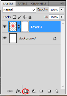
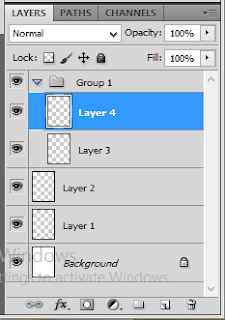 |
| Fig 1.1 Layers |
Hue/Saturation, Brightness/Contrast and Match color can be found in 'Image - Adjustment'. Hue is to change color of an image. Saturation is to make color more vibrant. Lightness is is to make the image whiter/darker in all area.
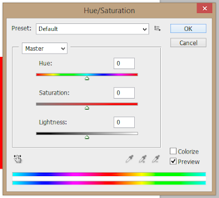 |
| Fig 1.2 Hue and Saturation |
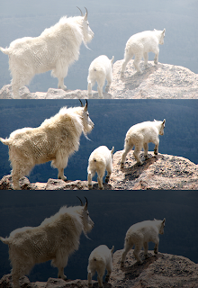 |
| 1.2.1 Lightness +60 and -60 |
Brightness is to make an image lighter, but the different with lightness, Brightness is only effecting a certain area while lightness effecting all part of the image. Giving more brightness only effecting part of the image with light, giving less brightness only effecting part of the image with shadows. Contrast is making a dull or flat color image to have more punch and contrast.
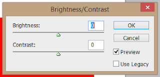 |
| 1.3 Brightness and contrast |
 |
| Fig 1.3.1 Brightness +60 and -60 |
Match color is a tool to make an image that added to the background have same color and brightness. This tool is great for photo manipulation. Inside the tool itself, there a few adjustment, luminance is to make the image brighter and contrast. Color intensity is to make the image more saturated. Fade is to control how much the match color added.
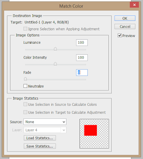 |
| Fig 1.4 Match Color |
Noise can be found in 'Filter - Noise - Add Noise'. One thing that make an image can be known that it is an edit or a photo manipulation is the different resolution. A bad resolution can't be change, so what we can do it to 'lower' the better resolution photo. To do that is to use noise, by adding a bit of noise, the photo will look more blended with the rest of the background.
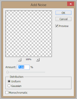 |
| Fig 1.5 Add Noise |
Another tool is a free transform tool. You can find it from 'Edit - Free Transform'. Short cut for this tool is Control (PC)/Command (Mac) + T.
 |
| Fig 1.6 Free Transform |
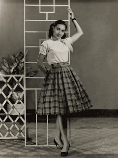
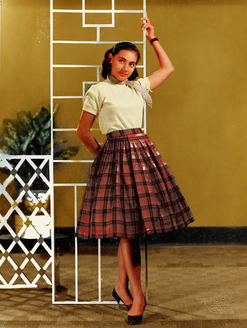
Our first exercise is to add our photo to a photo of Hearst Mansion. We were told to make it as realistic as we can, using all the tool given.
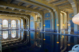 |
| Fig 1.7 Hearst Mansion |
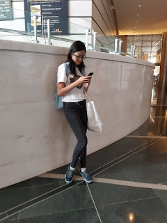 |
| Fig 1.8 Photo before edited. |
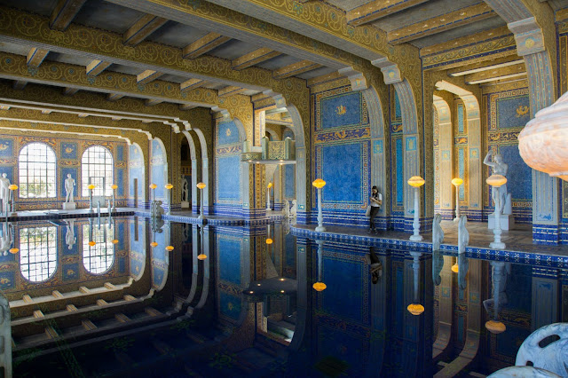 |
| Fig 1.9 Hearst Mansion after photo manipulation. |
This is the first class and I feel like I'll enjoy this class. I want to learn new things and I believe I can improve my skills. I also learn about noise. I never knew decreasing photo quality that way. After I add the filter, the edit become 1 composition instead of 2 pictures being compile together.
Observation
Mr Jeffrey explaining things really fast. Some of my friend that not familiar with the workplace is having problem locating some tools.
Finding
I find a new tool to use name 'Match Color'. I used to edit color manually, I think I can use this tool on future exercises.
Lecture 2: Masking and Blending Mode
09/04/19 (week 2)
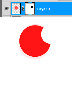
Today we are learning masking. Photoshop have this really cool feature that allowed user to erase some part of the image, and still allowed us to edit them again. Masking tool can be found at the bottom of layer box. We can use brush tool, fill tool, or gradient tool as long as the color use is black or white color, we can make masking to an image, black to erase some part of an image and white to add some part of an image.
 |
| Fig 2.1 Masking tool |
 |
| Fig 2.2 How masking tool work. |
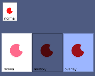
The other thing we learn is blending mode for layers. The tool can be found in the layers box as well. There a lot of type but what we learn today is multiply, screen and overlay. Multiply is to erase white from a photo and keep the dark/black color. Screen is the opposite of multiply, it erase dark color/black and keep the white in a photo. Overlay is the combination of multiply and screen.
 |
| Fig 2.3 Blending mode |
 |
| Fig 2.3 Difference between screen multiply and screen |
For today exercise, we are told to make a picture of a house change background to a sunset. The house was taken when it was daytime, so we need to match the color of the house as well. We are instructed to use the masking tool to do this.
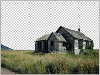
 |
| Fig 2.4 First photo, a house |
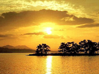 |
| Fig 2.5 Second photo, a sunset |
 |
| Fig 2.6 Progress 1, removing background using quick select |
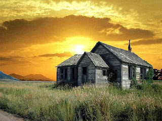 |
| Fig 2.7 Progress 2, adding new background |
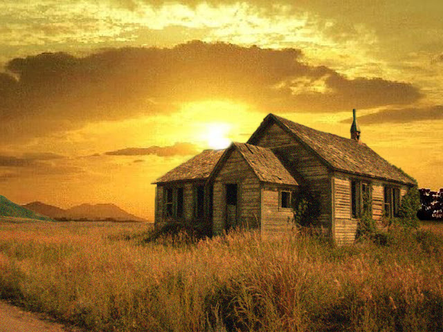 |
| Fig 2.8 Final work of photo manipulation. |
Today we learn blending mode. I still getting used of the campus computer since it is mac. I used masking tool before so I'm comfortable with the tool already. I saw a few of my friend struggling with the tool since they are not used to it.
Observation
When I use quick selection tool, I found that there's white lines around the house. I was because of a few color pixel not selected properly. I need to go back and fix that to give a realistic image.
Finding
I find that changing background like this is now that hard.
Lecture 3: Photo Restoration
16/04/19 (week 3)
Today we are trying to recolor vintage photo. The tool used for this is a brush tool. It can be found on the tool box, if you can't found the tool box or it is not active, go to 'Window - Tools' and the tool box should appeared.
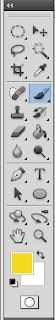 |
| Fig 3.1 tool box, brush tool the one that highlighted |
Add colors that you think it is right with the picture on new layers with the brush tool. Make sure the layers are on top of the original picture and on a blending mode. The mode I use is soft light, but feel free to try another modes. Brush also have hardness and softness on the setting, if you want a clean edges, use harder brush, if you want a soft airbrush, soften the brush. I recommend not to use 100 percent hardness on a brush, if you do that, the pixel will visible and the edges will look rigid, try to use 90 to 95 percent.
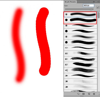 |
| Fig 3.2 Brush settings |
Before and after photos.
 |
| Fig 3.3 Practice before and after. |
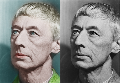
After practice, Mr Jeffrey told us to pick a picture to resonate. I choose this photograph.
 |
| Fig 3.4 black and white photo I choose |
This is my progress of making restoration.
 |
| Fig 3.5 Progression of restoration |
 |
| Fig 3.6 final photo. |
I had a lot of problem picking colors for each component of the picture. Mr Jeffrey told me that my coloring style is really old kind of coloring, he said this picture look like it was took from a Polaroid camera.
Observation
When doing restoration, I can't just pick any color. I need to imagine how the image was back then, how the colors of the place.
Finding
I found that even when I use the same color palate for every skin, because of the shadows, some part looks darker than the other.
Lecture 4: Changing One's Stripes
23/04/19 (week 4)
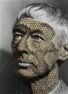
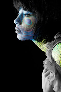
This week we learn how to add a 'skin' using displace tool. You can find the tool at 'Filter - Distort - Displace'. The tool allowed you to have a texture or image, to fit your face features. for example.
 |
| Fig 4.1 Practice 1 |
 |
| Fig 4.2 Progression 1 |
 |
| Fig 4.3 Practice 2 |
To do this, you should have one background file that the image wants to follow. For example, the fabric from the second practice. The background need to put on black and white and saved as a second photoshop file. This is done because the tool is following the light and shadow from a picture to know where is the part they need to stretch. Using the color black and white is the way to do it. You can change the file into black and white by dis-saturated the photo.
The exercise is the same thing, but we have to pick our own photo. I choose this picture. The photo already black and white, so I just have to resaved it as psd. I want to make the skin have a different color, and I choose blue because it is fit the emotion of the picture, but still contrast enough to stand out.
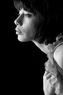 |
| Fig 4.3 Photo that I picked |
I use a few blending tool for editing this, Soft light, hard light, and overlay.
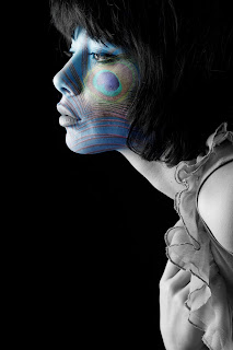 |
| Fig 4.4.1 progression 1 |
 |
| Fig 4.4.2 progression 2 |
 |
| Fig 4.4.3 progression 3 |
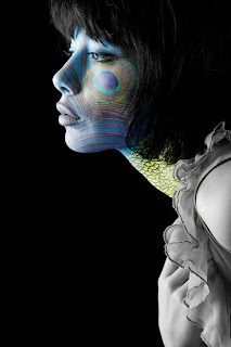
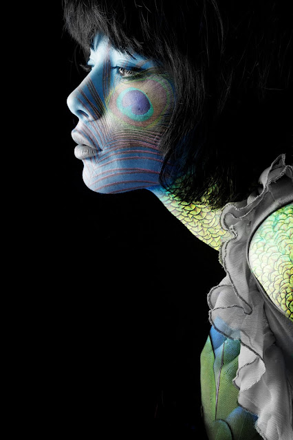 |
| Fig 4.5 Final artwork. |
I learned a new tool that I had never knew exist. It is not hard to use, but the only thing that hard for me is picking a picture to choose.
Observation
If I use the distortion too much, the picture will get 'rough' and unnatural. I need to be careful putting how much distortion I putted.
Finding
I need to be careful putting how much distortion I put. It's try and error at first but after a while, I get the hang of it.
Lecture 5: Castle of Pyrenees
30/04/19 (week 5)
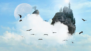
This week we are actually done learning new things. Mr Jeffrey are giving us exercise that allowed us using everything that we have learned this past few weeks. He also going to help us if we need help we certain things that have to be specific or not learned yet. Therefore we can learn faster. We are told to make a floating castle. We are allowed to use any picture of our choice for this, what we need to be careful of is the perspective of the pictures.
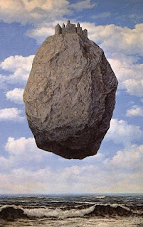 |
| Fig 5.1 Example from Mr Jeffrey |
I was going to search for my background or sky picture first so I can imagine the perspective of the picture. I find the picture that I like, but Mr Jeffrey told me the background distract the castle, he told me to search for another picture.
 |
| Fig 5.2 First background. |
 |
| Fig 5.3 Second background |
I can leave the class at 10, but I decided to stay in case I need help along the way. I pick more things to put on the image.
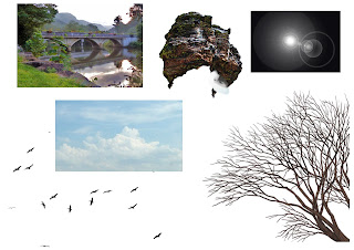 |
| Fig 5.4 Item used |
I manage to make this far, but I decided to add more things like sun flare and another floating rock. I tried to make a bridge between both of the rock but I can find an image that fit the perspective. What I manage to come out during class.
 |
| Fig 5.5 Progress of floating castle |
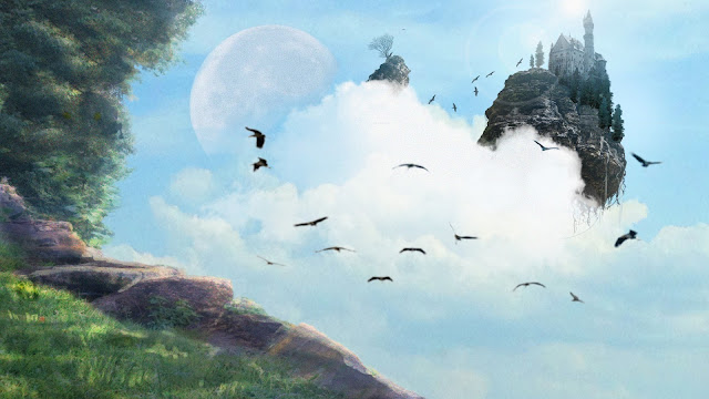 |
| Fig 5.6 Final Image |
I have a lot of problem picking the castle and I kept changing the composition. I also had problem erasing the background of the castle because it has a lot of small lines that hard to detected with quick selection tool so I have to go back and fix it manually
Observation
When I'm doing this exercise, I knew I need to be careful at the perspective. So when I'm searching for the castle, I prioritize the perspective first before the castle look.
Finding
I find that knowing the blending mode to use is really helpful when doing the exercise because I use a lot of them when making the castle part of the rock.


Comments
Post a Comment