TYPOGRAPHY - Project 2

17/05/19 – 31/05/19 (Week 7 – Week 9)
Arletta Leviani (0337751)
Typography
Project 2: Font Design
Lecture 7: Text / Tracking: Kerning and Letterspacing
17/05/19 (week 7)
Kerning is often mistaken as letterspacing, but they are not the same. Letterspacing means to add space between the letters. The removal of spacing between letters is called kerning. When you are formatting your body text on left alignment, the right hand side going to make raging and if it is too much, we need to make kerning and letterspacing.
- shift + enter: to force letter to go down
- alt + right arrow: to add letterspacing
- alt + left arrow: to add kerning
If you use both kerning and letterspacing, the term to use is tracking. Be careful while using tracking, too loose or too tight tracking can make viewer hard to read, the purpose of using tracking is to make it easier to read.
 |
| Fig 1.1 Kerning |
Text formatting
- Flush left, ragged right: This format most closely mirrors the asymmetrical experience of handwriting.
- Centered, ragged on both sides: Not good for a large amount of text
- Flush right, ragged left: This format places emphasis on the end of a line as opposed to its start.
- Justified: Issued from rivers giving an uneven color/gray matter (body text)
Text type is important to take notice, some typefaces can not be use as a body text. If you know the typeface first before the words, then you should change it. Typeface are not suppose to distract the massage in the first place. Don't design for the sake to look good, design to enhancing the massage from the writer.
 |
| Fig 1.2 Type Speciment |
Lecture 8: No Lecture
24/05/19 (week 8)
We are instructed to show our digitize pieces but we haven't done it. We did it right away on Adobe Illustrator.
Lecture 9: Text / Indicating Paragraphs
31/06/19 (week 9)
There are several way to indicate a paragraph. Back then in Latin, papers are made out of animal skins and they are expensive. To save money, people start using ‘pilcrow’ (¶) to indicate a different paragraph.
Paragraph spacing is also called line space. To count how much spacing needed,
it is the size of font (usually 8-10, ideally 9) added by 3.
 |
Fig 1.3 Difference between line space and leading
|

Extended paragraph creates unusually wide columns of text. Despite these
problems, there can be strong compositional or functional reasons for choosing
it.
 |
| Fig 1.5 Extended paragraph |
Widows and Orphans
- Widows: a short line of type
left alone at the end of a column of text.
- Orphans: a short line of type
left alone at the start of a new column.
Widows and orphans is a
term used when a word or a sentence is left behind in a paragraph. The only
solution to widows is to rebreak your line endings through out your paragraph
so that the last line of any paragraph is not noticeably short.
 |
| Fig 1.6 Orphans and widow |
Highlight
In a huge paragraph, sometimes there a paragraph that wanted to be highlighted, to achived that, it required different kinds of contrast, there a few ways of doing that.- Using different weight of fonts, like italic or bold.
- Using different color
- Using different typefamily, when using sans serif, the writing will look larger, make sure to decrease the size by 0.5 to match the x-height of the serif typeface.
- Using field of color at the back text, make sure to maintain the axis of the text, never use left flash when using this method.
- Using bullet points, you can follow the axis or not. Both is allowed.
- Using quotation marks, some designers want to follow the axis, but some not. Both is allowed.
There are many kinds of subdivision within text of chapters. It usually labeled as A, B, C according to the lever of importance. They are called hierarchy. A head indicates a clear break between the topics within section. Examples ‘A’ heads are set larger than the text, in small
caps and in bold. The fourth example shows an A head ‘extended’ to the left of
the text.
 |
| Fig 1.7 Subdivision example 'A' |
The B head here is subordinate to A heads. B heads
indicate a new supporting argument or example for the topic at hand. As such
they should not interrupt the text as strongly as A heads do. Here the B heads
are shown in small caps, italic, bold serif, and bold san serif.
 |
| Fig 1.8 Subordinate example 'B' |
The C heads, although not common, highlights specific
facets of material within B head text. They not materially interrupt the flow
of reading. As with B heads, these C heads are shown in small caps, italics,
serif bold and san serif bold. C heads in this configuration are followed by at
least an em space for visual separation.
 |
| Fig 1.9 Highlight specific example 'C' |
Text/Cross Alignment
Cross aligning headlines and captions with text type
reinforces the architectural sense of the page—the structure—while articulating
the complimentary vertical rhythms. In this example, four lines of caption type
(leaded 9 pts.) cross-align with three lines of text type (leaded to 13.5pts).
 |
| Fig 2.0 Example 1 |
Below, one line of headline type cross-aligns with two lines of text type, and (right; bottom left) four lines of headline type cross-align with five lines of text type.
 |
| Fig 2.1 Example 2 |
INSTRUCTIONS
PROJECT 2
Week 7
After trying to print our project 1, I was instructed to dissection and deconstruction for visual analysis of a letter with certain typeface. We were told to pick 1 of the 9 typefaces given by Mr Vinod. I chose Univers LT Std.
 |
| Fig 3.1 Univers LT Std. Typeface. |
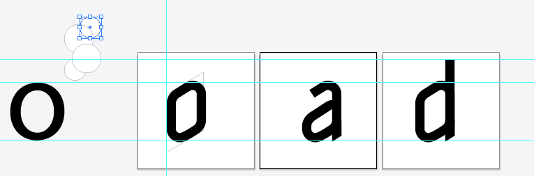
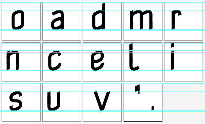
We were told to have 5 complex letters to dissection and deconstruct.
 |
| Fig 3.2 Dissection and deconstruct letters. |
 |
| Fig 3.2.1 Dissection and deconstruct letter a. |
 |
| Fig 3.2.2 Dissection and deconstruct letter m. |
 |
| Fig 3.2.3 Dissection and deconstruct letter r. |
 |
| Fig 3.2.4 Dissection and deconstruct letter d. |
 |
| Fig 3.2.5 Dissection and deconstruct letter o. |
After we are done dissecting our letters, we start to make our own typeface with our new knowledge from dissecting existing typeface. I started with a few sketches. Mr Vinod say that our characteristic have to included to every letters, and it has to be cleared to see.
 |
| Fig 3.3 First sketches |
 |
| Fig 3.4 Second sketches |
Week 8
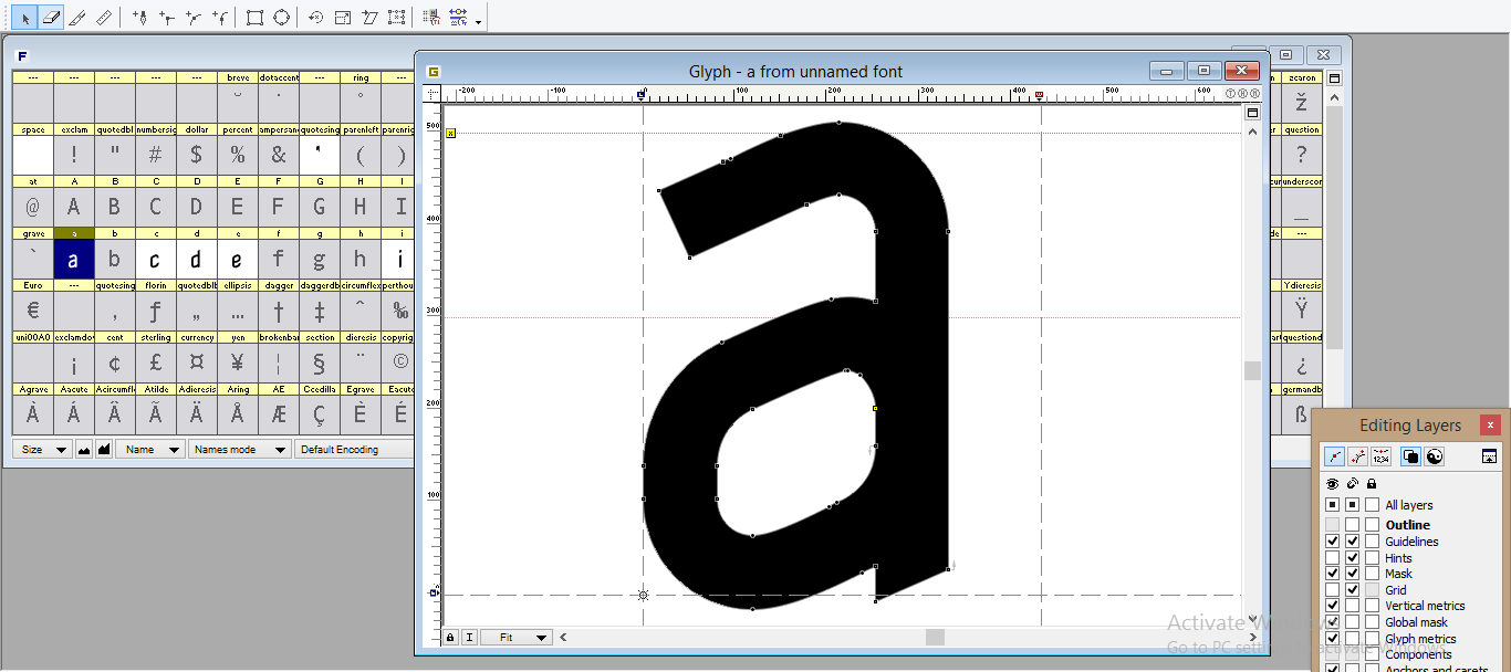
We are told to digitize our work right away since Mr Vinod expect us to be done with them already. I start to do so using Adobe Illustrator.
Mr Vinod saw my work and said that I did it wrong, he then showed me the correct way to do it. He told me to use strokes first, not shapes like I did before. He showed me how to use strokes to achieved a clean lines with several letters.
After showed the correct way to do it, I restart everything again. I remade the letter 'o' again like how Mr Vinod just told me so I understand it completely. Because the letter 'o' is a base letter, I can copy it's strokes to make other letters.
 |
| Fig 4.1 First digitization |
Mr Vinod saw my work and said that I did it wrong, he then showed me the correct way to do it. He told me to use strokes first, not shapes like I did before. He showed me how to use strokes to achieved a clean lines with several letters.
 |
| Fig 4.2 Digitization example by Mr Vinod |
After showed the correct way to do it, I restart everything again. I remade the letter 'o' again like how Mr Vinod just told me so I understand it completely. Because the letter 'o' is a base letter, I can copy it's strokes to make other letters.
 |
| Fig 4.3 Final digitization |
Week 9
After that, we are told to install Fontlab Studio, Mr Vinod specifically ask for version 5, not the newest one that is version 6. We are told to put everything on Fontlab at home before class.
After everything is done, we start to adjusted the kerning.
After everything done, we are naming our font and we generate our font. I eventually name mine with my last name 'Leviani'.
 |
| Fig 4.4 progression of putting letters in Fontlab |
After everything is done, we start to adjusted the kerning.
 |
| Fig 4.5 Progression of adjusting kerning |
After everything done, we are naming our font and we generate our font. I eventually name mine with my last name 'Leviani'.
 |
| Fig 4.6 Font info |
 |
| Fig 4.7 Final letters with base line, Leviani MT Regular |
 |
| Fig 4.8 Artwork Type face, Leviani MT Regular |
My final font,
FEEDBACK
Week 7
General Feedback
General Feedback
We were told to see the grids of text body and headlines by adding boxes. Therefore we can see the balance. please put your personality in the picture description.
Specific Feedback
I was told my design concept is good, the work Manifesto is better to have the same height of the other headings. The sub headlines should be fixed as well.
Week 8
General feedback
General feedback
We should have digitize our work before class instead doing it in class. Please read books from the library for more knowledge for making fonts. Before putting on fontlab, make sure your artwork is correct and no open spaces and lines are collected.
Specific Feedback
My font look rigid because I made it with shape. Mr Vinod told me to change into strokes instead. I need to make sure everything is consistent. After changing to stroke, Mr Vinod I did a good job, I need to change the letter U so it os the same height.
Week 9
General feedback
make sure you recorded your feedback in the feedback sheet and in the blog. Make sure the color is in red if its copy paste it. Put description the photos in the blog, Don't leave it blank. For reflection, it is for our own good. our learning by our reflection help us develop and help the lecturer understand us better.General feedback
Specific Feedback
My font looks good, at first when I made the kerning myself, it is a bit too close. After I fixed it, I generate the font and everything is done.
REFLECTION
Experience
Week 7
I start to sketch out my font. Mr Vinod told us to make a very clear characteristic each letters. We are sketching on graph papers. I'm just glad I bring my paper on that day because it helps me in the making of my letters. When I made my dissection letters, it is really hard for me to do because I need to make each shape (circle and lines) to exact scale.
Week 8
When I did my digitization, I'm glad I ask a lot of question to Mr Vinod at the start. Turns out I made a mistake by using shape instead of strokes. After Mr Vinod told me the correct way, I manage to finish everything on class time. He approved my design and my digitization.
Week 9
We are doing our kerning today and I thought it was going to be hard but it is really easy. I had trouble understand how to do it because Mr Vinod explained to a lot of people on the same time, and I can hardly hear. I ask my friend for help and I manage to do it.
Observation
Week 7
I noticed that I manage to be more comfortable on Adobe Illustrator the more I used it. I manage to make things faster.
Week 8
I was ask by Mr Vinod to help my friends that sits beside me things that he just teach me. I notice that I'm really bad at explaining things to them because their characteristics are different from mine. I can't explain much to them except for the very basic of the explanation.
Week 9
I notice that adjusting kerning are different for every characteristic and typeface. There are kening that better tight and there are better loose. Mine better to be more tight because the boxy characteristic I had.
Finding
Week 7
I find that making font on graph papers are easier than using normal paper.
Week 8
Digitizing the letter 'o' first is really making everything else faster because the letter 'o' is a base for other letters. I also find that it's better to ask earlier in class so I don't waste time doing things that are wrong.
Week 9
I find that Fontlab version 5 and 6 are really different. Also find that kening are different for every typeface.
FURTHER READING
A Basic Introduction to Typography by Northern Highlands.
week 8-9 (24/05/2019-31/05/2019)
week 8-9 (24/05/2019-31/05/2019)
 |
| Fig 5.1 A BASIC INTRODUCTION TO TYPOGRAPGHY |
Line breaks and Rag
In typography, “rag” refers to the irregular or uneven vertical margin of a block of type. Usually it’s the right margin that’s ragged but either or both margins can be ragged. A good rag goes in and out from line to line in small increments. A poor rag creates distracting shapes of white space in the margin. Don’t rely on the line breaks generated by your software application; get in the habit of spotting and correcting poor rags by making manual line breaks or by editing your copy.
Hyphens
Proper hyphenation allows for a better-looking, tighter rag – or, in the case of justified type, a more natural, even text color. Hyphenation also allows more words to fit in a line, which saves space.
Widows and Orphans
If a single word or very short line is left at the end of a column it is called a Widow. If the same is left at the top of the following column this is called an Orphan. Both of these are considered bad typography as they cause distracting shapes in a block of type. They can usually be fixed easily in the same way as the rag, by reworking the line breaks in the column or by editing the copy.
Comments
Post a Comment