14/06/19 – 28/07/19 (Week 11 – Week 12)
Arletta Leviani (0337751)
Typography
Final Project: Expression, Hierarchy and Composition
Lecture 10: Typography in Different Medium
Type for Print
In the past, typography was viewed as living only when it reached paper. Once a publication was edited, typeset and printed, it was done. Nothing changed after that. Good typography and readability were the result of skilled typesetters and designers. Typesetters are people who make typography before the digitize era and before the designers exist. Today, typography exists not only on paper but on a multitude of screens. It is subject to many unknown and fluctuating parameters, such as operating system, system fonts, the device and screen itself, the viewport and more.
Type for Print
A good typeface for print-Caslon, Garamond, Baskerville are the most common typefaces that is used for print. Because of their characteristic which are elegant and intellectual but also highly readable when set at small font size.They are versatile, easy-to-digest classic typeface, which has a neutrality and versatility that makes typesetting with it a breeze.
Type for Screen
Another important adjustment – especially for typefaces intended for smaller sizes – is more open spacing. All of these factors serve to improve character recognition
- Hyperactive Link/ hyperlink
- Font Size for screen
- Pixel Differential Between Devices
 |
| Fig 1.1 Pixel difference |
Static typography has minimal characteristic in expressing words. Traditional characteristics such as bold and italic offer only a fraction of the expressive potential of dynamic properties.Motion Typography is a temporal media offer typographers opportunities to “dramatize” type, for letterforms to become “fluid” and “kinetic” (Woolman and Bellantoni, 1999). Film title credits present typographic information over time, often bringing it to life through animation. Type is often overlaid onto music videos and advertisements, often set in motion following the rhythm of a soundtrack. On-screen typography has developed to become expressive, helping to establish the tone of associated content or express a set of brand values. In title sequences, typography must prepare the audience for the film by evoking a certain mood.
Primarily, type was designed intended for reading from print long before we read from screen. It’s the designer’s job to ensure that the text is smooth, flowing, and pleasant to read. To do this, they adjusted the kerning to make the reading experience better. Typefaces intended for use on the web are optimized and often modified to enhance readability and performance onscreen in a variety of digital environments. This can include a taller x-height (or reduced ascenders and descenders), wider letterforms, more open counters, heavier thin strokes and serifs, reduced stroke contrast, as well as modified curves and angles for some designs.
A hyperlink is a word, phrase, or image that you can click on to jump to a new document or a new section within the current document. Hyperlinks are found in nearly all Web pages, allowing users to click their way from page to another. Text hyperlinks are normally blue and underlined by default. 16-pixel text on a screen is about the same size as text printed in a book or magazine; this is accounting for reading distance. Because we read books pretty close — often only a few inches away — they are typically set at about 10 points. If you were to read them at arm’s length, you’d want at least 12 points, which is about the same size as 16 pixels on most screens.
No Lecture
21/06/19 (week 12)
We finished our lectures, we didn't have any lecture this day.
INSTRUCTIONS
FINAL PROJECT
Week 11
After we are done with our lecture, we are given instruction of our final project. We need to find a sentence that can be applied in everyday life. We allowed to make our own sentence or we can copy the one that already exist. We are going to be scored based on composition, type expression from the words we pick. We need to animate them after everything approved.
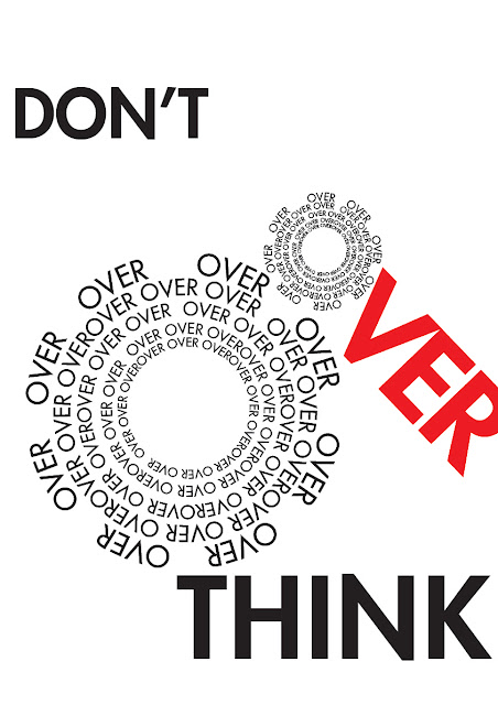
My first idea is to use my original font since we are allowed to use them, but since we only made 15 letters, I can't make a sentence with them. My first idea of the words is 'Don't Overthink'. I got approval on the words but I can express them well. I change to 'Don't Overwork Yourself'.
 |
| Fig 2.1 First sketch, 'Don't Overthink' |
 |
| Fig 2.2 Second sketch, 'Don't Overthink' |
 |
| Fig 2.3 Third sketch, 'Don't Overwork Yourself' |
Week 12
Mr Vinod told me to fix the wheels so it's more clean and neat. He also said to make the composition better. I made several changes and then change the words to 'Don't Overwork Yourself' since I feel like it is more fitting. I use Futura as my typeface.
 |
| Fig 3.4.1 Different version for 'Don't Overwork Yourself' |
 |
| Fig 3.4.2 Different version for 'Don't Overwork Yourself' |
 |
| Fig 3.4.3 Different version for 'Don't Overwork Yourself' |
 |
| Fig 3.4.4 Different version for 'Don't Overwork Yourself' |
I asked Mr Vinod for his feedback and I was told to add the word 'yourself' to be more fitting. Also not to pick grey as a color because it is won't be so good for printing. He also told me to make the font size the same with each other. He said to make sure the kerning is correct, and also make doted lines to give sense of movement.
 |
| Fig 3.5 Design for 'Don't Overwork Yourself' after first feedback |
 |
| Fig 3.6 Design for 'Don't Overwork Yourself' after second feedback |
 |
| Fig 3.7 Design for 'Don't Overwork Yourself' after thrid feedback |
 |
| Fig 3.8 Design for 'Don't Overwork Yourself' final in jpg |
Animating Progression
I never had never done animation in Adobe After Effect to make Gif, so I did a few research how to do it. One of the way to make gif is to use Adobe Photoshop as well. I need to make each
 |
| Fig 3.9 animating progress, after effect |
 |
| Fig 4.0 animating progress, all the jpeg file |
My after effect can't convert my animation into gif, so I convert every frames into picture and add them into Adobe Photoshop. I put every frames like how I was thought by Mr Vinod for my exercise.
 |
| Fig 4.1 animating progress, animating into gif in photoshop |
 |
| Fig 4.2 final animation |
Week 13
In week 13, we are expected to print our design and have our frames ready. We are told to get a 40 x 50 cm frame and after we got approval, we are allowed to frame our design. Our print is in A3 size printed in poster paper.
 |
| Fig 5.1 Framed artwork |
 |
| Fig 5.2 Framed artwork, with no reflection |
 |
| Fig 5.3 Framed artwork |
FEEDBACK
Week 11
General Feedback
I was told to find a powerful statement for our final project, better if we sketch it in black and white and add colors later. Do see the existing blog from our senior because our content is 30% less then supposed to be.
Specific feedback
For my final project, he told me to not overthink, overthink can kill. He approved my design with a side note to not over think.
Week 12
Specific feedback
Mr Vinod said that my work doesn't really make sense and said that I should make a new design. I made new design and he likes the idea, but he hope that I fix the composition and fix my font sizes because it looks messy. He also said to not have too many effects inserted in each composition. I fix it and he said to make a circle shape behind. He said to place the artwork first (the wheels) as a composition and add the rest of the words
Week 13
Feedback on Tuesday
Pick another color, not black red and white because it's too strong and too bright, the color grey won't print well so don't use them. Add another the word 'yourself' on 'don't overwork'.
Feedback on Thursday
Mr Vinod told me to make sure the font size is all the same instead of having 2 different one, it is okay to go over the border because people still can read it. Make sure to have proper word spacing and make dotted lines to give a movement effects. Mr Vinod also told me to make sure the doted lines are proper circle.
REFLECTION
Experience
Week 11
I'm having a hard time pick sentence because I need to think of the design and think how I'm going to animate them later. I'm also not clear with some of the rules. We are allowed to make shapes to support our expressions, but there's not a real clear line to how much we are allowed. I don't want to redo my design because I'm using shape so I played safe and didn't use shapes.
Week 12
I was having a hard time picking on colors, I thought the color red would be fitting since it indicate stress but turns out it's too strong. I need to learn more about color theory more. I also just know that I can make Gif from Adobe After Effect.
Observation
Week 11
I notice that every time I want to copy something I'm getting used of using alt instead of ctrl + c and ctrl + v. I got so used to it to the point I use it unconsciously outside of Adobe Illustrator and got confused why it is not working.
Week 12
I notice that sometimes I don't know a certain tool and didn't know how to use them, I'm glad that my friend share their knowledge with me. I manage to make the circles thanks to their help.
Finding
Week 11
I find that I overthink my work and make the composition look bad. I need to think simple and not overthink everything.
Week 12
I find that I have so many version of my design, I also notice that even the littlest different position can make a different in the composition.
FURTHER READING
Towards a New Age Graphic Design by NCERT.
week 11-12 (14/06/19 – 21/07/19)
 |
| Fig 6.1 TOWARDS A NEW AGE GRAPHIC DESIGN |
Expressive Typography
A designer can use fonts creatively for expressing various
emotions. One can select a font which can convey an emotion
or you can play around with the way you use letters.
 |
| Fig 6.2 Expressive Typography |
Many expressions can be presented through letter forms.
By experimenting with some of the parameters listed below,
you can create typographic expressions.
 |
| Fig 6.3 different way to express |


Comments
Post a Comment