ADVANCES TYPOGRAPHY - FINAL PROJECT

21/10/19 – 18/11/19 (Week 9 – Week 13 )
Arletta Leviani (0337751)
Advances Typography
Final Project
INTRODUCTION
FINAL PROJECT
Week 9-13For our final project, we are needed to pick what we wanted to do, between experimental or to develop a typeface to colve certain problem. I decided to make a typeface from a traditional script from Indonesia, 'Kawi Script'. Some Indonesia traditional script are rarely used and some even about to extincted.
Kawi script (कवि) or Aksara Jawa Kuna is a traditional script from Indonesia that developed to a major script like Javanese, Balinese, Sundanese. The earliest known texts in Kawi date from the Singhasari kingdom in eastern Java. The more recent scripts were extant in the Majapahit kingdom, also in eastern Java, Bali, Borneo and Sumatra. The Kawi script has attracted scholarly interest both in terms of the history of language and script diffusion, as well as the possible routes for the migration of Buddhism and Hinduism to southeast Asian region because many of the major scripts of southeast Asia show South Indian Pallava script influence.
 |
| Fig 1.1.1 Kawi Script |
 |
| Fig 1.1.2 Kawi Script consonants |
Based on News outlet 'Kompas' there are 11 traditional script that being said have extinct, 4 on the break of extinction. Those script are from Maluku and Papua. UNESCO said in 2009, there are 2500 languages including 100 in Indonesia and they are in the break of extinction. 200 language will be extinct in 30 years if no further action in the future.
This is the final project proposal:
I start to take note of the unique features and do some sketches on paper.
 |
| Fig 1.2.1 First Sketch |
 |
| Fig 1.2.2 Second Sketch |
This is the first draft, I started with the letter O like I was taught on the first semester. I make sure each letters have some contrast of the width. I remember most of the feedback from last semester, and one of the feed back given by Mr Vinod is to use line strokes to make the letters then convert them to shape later on, not to make them using pen tool. I also remember to use the same shapes I made earlier so all the letters have the same unique features.
 |
| Fig 1.3 First draft making and refining progress |
 |
| Fig 1.4 First version |
I then fixing some of the line weight so they have the same weight each. With Mr Vinod feedback, I make another version of the letter 'g' and 'f'. This is the final letters.
 |
| Fig 1.5 Second version |
My last feedback given from Mr Vinod in class is to make sure to trim the sharp edges. I make sure to fix that.
 |
| Fig 1.6 Final version |
I then move on the fontlab and insert all my letters in. I remember very little about fontlab from last semester and I manage to do it myself. I also adjust the kerning to fit every letters.
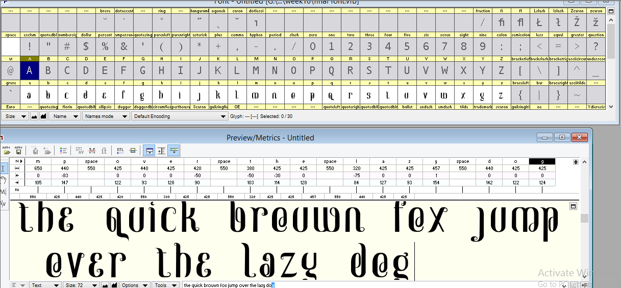 |
| Fig 1.7.1 Fontlab Progression |
 |
| Fig 1.7.2 Fontlab kerning adjustment |
This is the final typeface I made:
Next I digitized the traditional script. I use 2 references of traditional Kawi Script as my guidance. I put my references on Adobe Illustrator and start digitize them. I make sure to have round cap and corners so they are not too sharp.
 |
| Fig 1.8.1 Kawi Reference 1 |
 |
| Fig 1.8.2 Kawi Reference 2 |
I start making the basic of each letters, for example, I make 'k' first as the basic shape, then add other shapes to create other syllables like 'ki', 'ku', 'ke', 'ko', 'kai', 'kau'. Each shapes represent different letters but the original shape is use to indicate 'k'.
 |
| Fig 1.8.3 Traditional script progression 'k' |
 |
| Fig 1.8.4 traditional script progression |
There are total of 124 different syllables, but all have similar shapes from each other.
 |
| Fig 1.8.5 all syllables traditional script |
This is the application of typeface, I decided to use it for posters. I use a common place of public attraction to make sure people see it often. I pick ‘kawah putih’ from Bandung as example and 'gunung bromo' in East Java.
 |
| Fig 1.9.1 Kawah putih commercial poster |
 |
| Fig 1.9.2 Gunung Bromo commercial poster |
 |
| Fig 1.9.3 Gunung Bromo application |
For my collateral, I pick the word 'Majapahit' because it is one of the oldest kingdom in Indonesia and was using Kawi script back then. Maja is a type of fruit and pahit means bitter, maja pahit means bitter maja fruit. Majapahit is a big and strong kingdom, they rule Sumatra for decades until the king died and pass his throne to his son. The kingdom fell apart when one of the ancestor can't rule the kingdom well and a neighboring kingdom attracted making the fall of majapahit.
 |
| Fig 1.9.3 notebook, pencil, silver mailer mockup |
 |
| Fig 1.9.4 book mockup |
 |
| Fig 1.9.5 paper bag mockup |
 |
| Fig 1.9.6 lighter mockup |
 |
| Fig 1.9.7 Postcard mockup |
 |
| Fig 1.9.8 tags mockup |
 |
| Fig 1.9.9 Name card mockup |
FEEDBACK
Week 10
Online feedback
So what you want to do about it?
Last sem 6 students did the same thing, (diff scripts of indonesia)
Week 11
Please make sure update the blog, make sure not to missing any jpeg, pdf, and make sure it is clean to see which the one is the progress and the final submittion. The microsite link need to be active and make sure the link opened in another tab. Put pdf of the final submission (flat and poster), put a screenshot microsite.
Make sure to explain well on the eport as if they are read by those who never know about the projects.
troublemakers event:
make sure to ask question and do research of the speakers, be on time! Keep in mind the knowladge is for your final of your course. Some of them are not designers, so ask question to gain knowladge.
Specific Feedback
a senior already did the same thing, If i want to use the same script, make a different font type or make a different one.
Week 12
Specific feedback:
Mr Vinod said that I am okay just to make lowercase letters, just keep going. Chack Mr Mutu's work (from troublemakers manifesto).
Online feedback:
Finial stroke for the letter f is turning in the other direction when compared to the other ascenders. The g's bowl is a little awkward. Overall it does have an interesting look and feel. It would be great to refine it further but I suppose time is an issue.
Week 13
General Feedback:
to have all research there because it is one of the criteria for submission and grading.
Specific feedback:
Mr vinod say my work overall is good, if have enough time, should have little things to fix but because of time limit it is ok. I should do more collateral to sell my typeface instead of only 2. I need to digitized the kawi script too and put it in my collateral, if I don't want to I need to change to proposal.
REFLECTION
Experience
Week 10This Monday is holiday so I didn't have any class, but even so, I manage to get feedback from Mr Vinod through messenger. I was asking about my idea for my final project. I didn't try to check too much of the seniors work and didn't realize that my idea is exactly the same. I also try to make sure the script I was using is not the same as the seniors.
Week 11
Mr Vinod told me that it is okay to use my hometown's script which is Sundanese even when one of the senior did it already, but make different font type like serif and sans serif. I decided to search another script and find another to make another unique typeface. Eventually I found Kawi Script and I am really happy to find a unique kind that I can develop of.
Week 12
I have a few problem when making the first few letters. I wanted to make a bit of contrast of weight but also want to have curves for each letters to make them similar to the Kawi Script. I made the letter O first which making everything easier.
Observation
Week 10
I notice that given the opportunity to think about your own idea and work process is really hard. I really need to do a lot of research.
Week 11
I did a few sketches when doing my final project and I found out that making a few version of the letter is helping me to find the best version, especially for the letter O and G. When I am done sketching, I found that giving contrast of weight in typeface is helping the typeface look cleaner overall.
Week 12
I notice that by finding the unique feature of my script is making it easier. I took notes and make sure to add them to my letters. Making the letter O first is really helpful because I can reuse the curves from the letter O for other letters.
Finding
Week 10
I find that making sure to real a lot of articles and books, help me to find ideas. I find mine through a news outlet.
Week 11
I find that sketching ideas or just sketching general idea of the letters are really helpful, I manage to get the basic shape first and continue to make a few version. I manage to see which one I like the best out of all the versions and digitize it.
Week 12
I find that I forgot about fontlab already so I open my old file from semester 1 and copy all the information of the edited preferences. I eventually manage to do it well including the kernings, even when it took quite a while.
Mr Vinod told me that it is okay to use my hometown's script which is Sundanese even when one of the senior did it already, but make different font type like serif and sans serif. I decided to search another script and find another to make another unique typeface. Eventually I found Kawi Script and I am really happy to find a unique kind that I can develop of.
Week 12
I have a few problem when making the first few letters. I wanted to make a bit of contrast of weight but also want to have curves for each letters to make them similar to the Kawi Script. I made the letter O first which making everything easier.
Week 10
I notice that given the opportunity to think about your own idea and work process is really hard. I really need to do a lot of research.
Week 11
I did a few sketches when doing my final project and I found out that making a few version of the letter is helping me to find the best version, especially for the letter O and G. When I am done sketching, I found that giving contrast of weight in typeface is helping the typeface look cleaner overall.
Week 12
I notice that by finding the unique feature of my script is making it easier. I took notes and make sure to add them to my letters. Making the letter O first is really helpful because I can reuse the curves from the letter O for other letters.
Finding
Week 10
I find that making sure to real a lot of articles and books, help me to find ideas. I find mine through a news outlet.
Week 11
I find that sketching ideas or just sketching general idea of the letters are really helpful, I manage to get the basic shape first and continue to make a few version. I manage to see which one I like the best out of all the versions and digitize it.
Week 12
I find that I forgot about fontlab already so I open my old file from semester 1 and copy all the information of the edited preferences. I eventually manage to do it well including the kernings, even when it took quite a while.
FURTHER READING
The Elements of Typography Style by Robert BringhurstWeek 9-12 (21/10/19 – 18/10/19)
 |
| Fig 1.9 THE ELEMENTS OF TYPOGRAPHY STYLE |
- RENAISSANCE (15th & 16th centuries): modulated stroke; humanist [oblique] axis; crisp, pen-formed terminals; large aperture; italic equal to and independent of roman.
- BAROQUE (17th century): modulated stroke; variable axis; modeled serifs and terminals; moderate aperture; italic subsidiary to roman and closely linked with it.
- N EOCLAS SI CAL (18th century): modulated stroke; rationalist( vertical] axis; refined. adnate serifs: lachrymal terminals; moderate aperture: italic fully subjugated to roman.
- ROM ANT IC (18th & 19th centuries): hypermodulated stroke; intensified rationalist axis; abrupt, thin serifs; round terminals; small aperture; fully subjugated italic.
- REALIST (19th & early 20th centuries): unmodulated stroke; implied vertical axis; small ape rture; serifs absent or abrupt and of equal weight with main strokes; italic absent or replaced by sloped roman.
- GEOMETRIC M 0 DERN I ST (20th century): unmodulated stroke; bowls often c ircula r (no axis); moderate aperture; serifs absent or of equal weight with main strokes; italic absent or replaced by sloped roman.
- LYRICAL M 0 DERN IS T (20th century): rediscovery of Renaissance form: modulated stroke; humanist axis; pen-formed serifs and terminals; large aperture; 1tal1c partially liberated from roman
- POSTM 0 DERN I ST (late 20th & early 21st century): frequent parody of Neoclassical, Romantic or Baroque form: rationalist or variable axis; sharply modeled serifs and terminals; moderate aperture. (There are many kinds of Postmodernist letter


Comments
Post a Comment