INTERACTIVE DESIGN - PROJECT 2
07/10/19 – 14/10/19 (Week 8 – Week 10 )
Arletta Leviani (0337751)
Interactive Design
Project 2
LECTURE NOTES
Lecture 8: Styling Web Part 215/09/19 (week 8)
Lecture 9
15/10/19 (week 9)
No lecture this week.
Lecture 10
22/10/19 (week 10)
No lecture this week.
INTRODUCTION
EXERCISE
Week 8-10We were told that we are going to make a microsite to sell our mock-up that we design for Advance Typography class. This is the process in the making of the mock-ups.
https://arlettadesignjournal.blogspot.com/2019/10/advances-typography-project-2.html
When making the site, I really want to make a carousel from the start, but I want to make each carousel similar to each other and have a continues effect, even on mobile form. This is the cover images that I make, I don't want to reuse same images so I made new one specially for the carousels. I also make the carousel different call to action like going to the about, merch and event schedule.
 |
| Fig 1.1.1 Carousel image 1 |
 |
| Fig 1.1.2 Carousel image 2 |
 |
| Fig 1.1.3 Carousel image 3 |
I made the navigation panel and make a logo at the site as a home button as well.
 |
| Fig 1.2 logo |
I continue adding the about. I feel like the site is about the event and also selling the mock-ups, it would be weird if the site doesn't explain anything about the event itself. I decided to put the about right after the carousel. This is the image that goes beside the about.
 |
| Fig 1.3 about image |
I also add the event schedules after the about so if they are interesting, the other information is right under. I add a cover image at the back to compliment the key artwork and the overall theme. After the schedules, I proceed to make the merchandise part of the site. I make them into 3 different grids and give a hover effect. It took me a while to make sure it works especially when making the hover. I manage to make it right at the end. I make sure to make it square first so the height and width in the site is accurate and align.
 |
| Fig 1.4.1 first mock-up |
 |
| Fig 1.4.2 second mock-up |
 |
| Fig 1.4.3 third mock-up |
I then make a footer with the contact option is the user want to be notified about the events, I make the user add their first and last name, and also their email address. This is the progress of html and css.
 |
| Fig 1.5 html progress |
 |
| Fig 1.6 css progress |
This is the final microsite:
https://bugs-swallows.000webhostapp.com/index1.html
FEEDBACK
Week 8Specific feedback
Mr Lun told me I should ask him if I don't understand something instead of being quite. He also help me with the carousel problem and told me to make them as a cover instead of just an image.
Week 9
Specific Feedback
Mr Shamsul said nice. He said to fix the navigation panel because the margins too close, to make the logo a bit bigger than before since he can't really see it, and add a contact option at the bottom. He said I can submit mine after that.
I was having problem with the carousel but then mr Lun helped me and told me to use cover as the image instead just image. I also have a lot of problem when dealing with codes that I don't write. It took me a while to get use to it and know which one to change and adjust.
Week 9
Most of the parts of microsite are finished by this week but I need to add hovers and links. I have so much problem with this. There are times when the hover triggered by the whole row instead of just the image and there are times when the link button doesn't work. I manage to finished everything at the end.
Observation
Week 8
I notice that making a plan before making the site is really helpful, even when the end product is a bit different, I have a guideline of what I need to put on the site. I also notice that making new images is giving a more interesting site to look at.
Week 9
I notice that I need
Finding
Week 7
I notice that making a few design gives a better view of the best design instead of just settled on one right away. I did a few ones and finally happy with mine after several tries, especially on my shirts.
Week 8
A few things I noticed when making a design for a shirt is usually there are a small artwork in the left side of the chest, the middle of the chest but usually more wider, either back/front design of a big artwork.
Week 7-8 (07/10/19-14/10/19)
In the book, it was said that typography is storytelling, Clive Lewis and Peter Walker said that typefaces set the scene and clue you in to what the world will reveal.
REFLECTION
Experience
Week 8I was having problem with the carousel but then mr Lun helped me and told me to use cover as the image instead just image. I also have a lot of problem when dealing with codes that I don't write. It took me a while to get use to it and know which one to change and adjust.
Week 9
Most of the parts of microsite are finished by this week but I need to add hovers and links. I have so much problem with this. There are times when the hover triggered by the whole row instead of just the image and there are times when the link button doesn't work. I manage to finished everything at the end.
Week 8
I notice that making a plan before making the site is really helpful, even when the end product is a bit different, I have a guideline of what I need to put on the site. I also notice that making new images is giving a more interesting site to look at.
Week 9
I notice that I need
Finding
Week 7
I notice that making a few design gives a better view of the best design instead of just settled on one right away. I did a few ones and finally happy with mine after several tries, especially on my shirts.
Week 8
A few things I noticed when making a design for a shirt is usually there are a small artwork in the left side of the chest, the middle of the chest but usually more wider, either back/front design of a big artwork.
FURTHER READING
Why Fonts Matter by Sarah HyndmanWeek 7-8 (07/10/19-14/10/19)
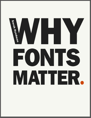 |
| Fig 2.1 WHY FONTS MATTER. |
In the book, it was said that typography is storytelling, Clive Lewis and Peter Walker said that typefaces set the scene and clue you in to what the world will reveal.
- Instinctive responses: react to typefaces and respond to the shapes.
- Learned associations: react from experiences, some from universal recognized or from unique experiences.
- Learned knowledge: The domain of the expert who has acquired a great deal of knowledge of the subject that gives a complex set of qualities.


Comments
Post a Comment